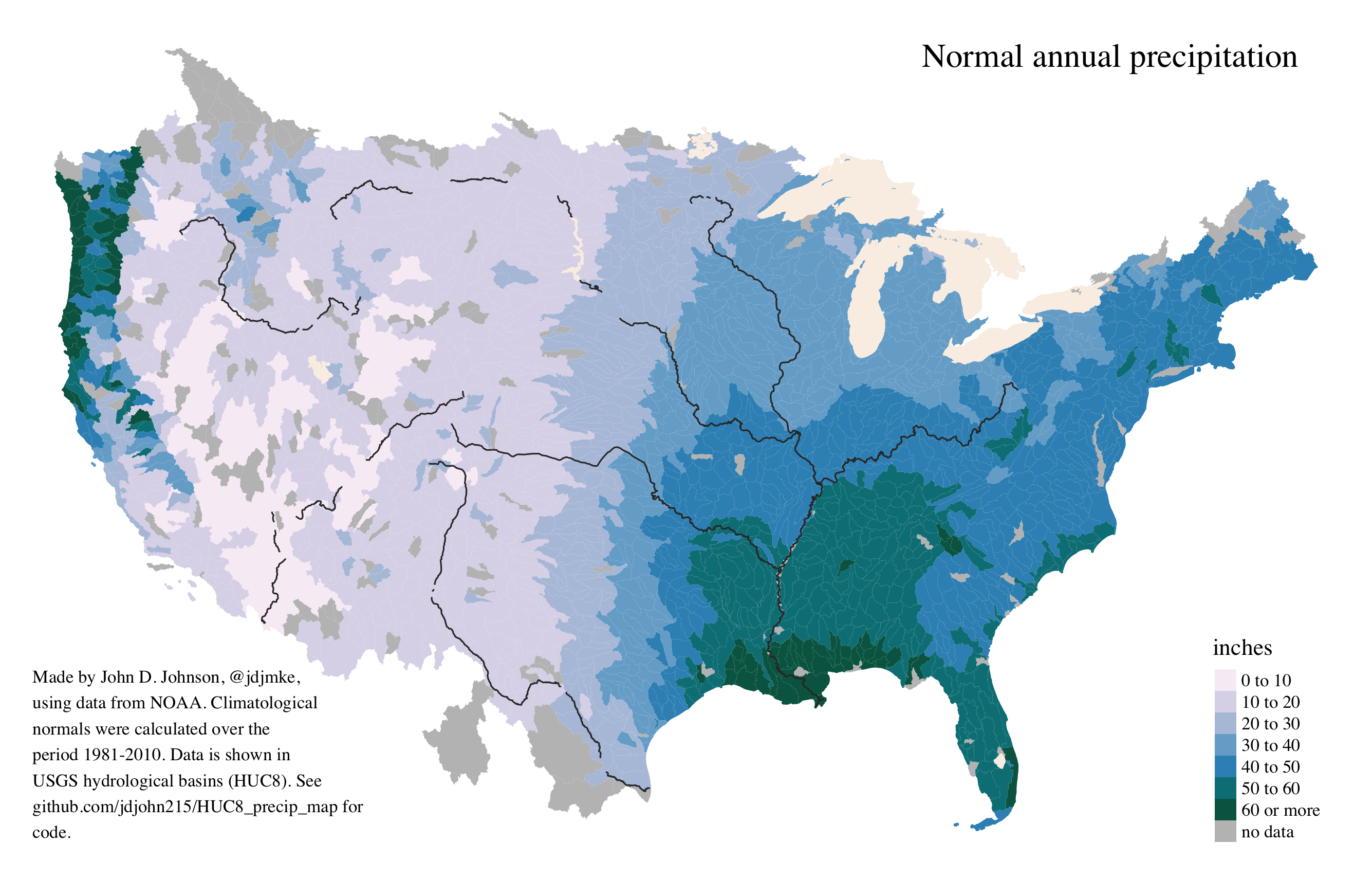
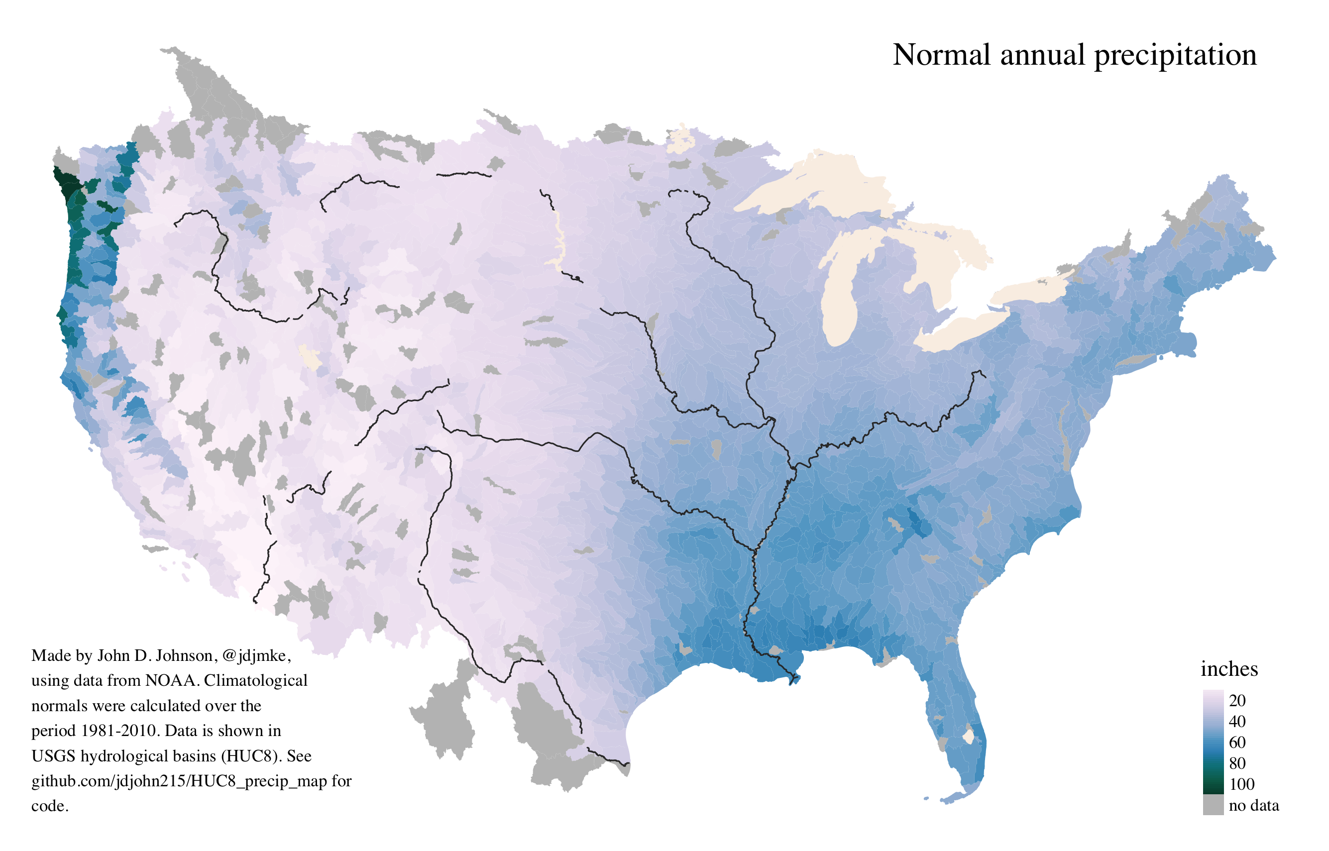
Maps of Average Rainfall in Hydrological Basins
These maps contain no political boundaries except those which happen to follow natural features. Instead, they show average levels of precipitation in hydrological basins–the category one size up from watersheds. The first map shows a continuous scale. The dryest basin receives the lightest hue, and the wettest basin displays the darkest shade. The second map shows a binned scale. Although the binned map makes it easier to see patterns, it also creates two kinds of error. On the one hand it suggests an abrupt change in places where there is only a gradual shift. On the other, it also flattens outliers by incorrectly suggesting that the Mississippi River delta is as wet as the Olympic Peninsula.
All the data and code needed to create these maps are available in this github repo.