A Look at Agricultural Economic Diversity in Wisconsin and Illinois
Here’s a mystery I often wonder about. Why are Wisconsin’s small towns doing so much better than those in Illinois? In rural Illinois, where I grew up, small towns often follow a predictable pattern: a few bankrupt factories on the outskirts, a ring of increasingly shabby houses, and a downtown of shuttered storefronts and empty churches. A growing number of towns lack even schools of their own, as dwindling numbers of children force the consolidation of first schools and then whole districts.
All the obvious culprits (deindustrialization, meth, opioids, plunging birthrates, etc.) struck Wisconsin too. Still, across Wisconsin, I often find something altogether more pleasant. Many little towns here retain a sense of stability, at least, if not prosperity. The mood feels brighter. More business remain open. Fewer homes are in obvious disrepair. There is a higher ratio of operable cars to broken-down chassis littering front yards. It can be hard to quantify this feeling, which involves more than any single measure of prosperity or decline.
Consider the population growth and decline since 2010 mapped in Figure 1. The patterns here hint at dozens of stories. Among them: vacationland popularity across Wisconsin’s northwoods and Lake Michigan’s eastern shore, booming growth around the Twin Cities and Indianapolis, and the ongoing population collapse of Illinois and rural Iowa.
Look a little longer and you might notice something else. Rural Wisconsin stands out for having an unusual degree of population stability. Given the widespread reality of sub-replacement birth rates, population loss is no surprise. But many rural Wisconsin counties actually grew slightly over the past 14 years. Among those that shrank, not a single Wisconsin county contracted by more than 5%. This stands in sharp contrast to the patterns in every other nearby state. More than a fifth of Illinois’ counties shrank by 10% or more from 2010 to 2024.
A 10% drop in 14 years is not small. Imagine a table with 10 people; now there are just 9. Repeat that across an entire neighborhood, parish, municipality, or school district. When the population falls this quickly, institutions cannot sustain themselves, at least not in the same way.

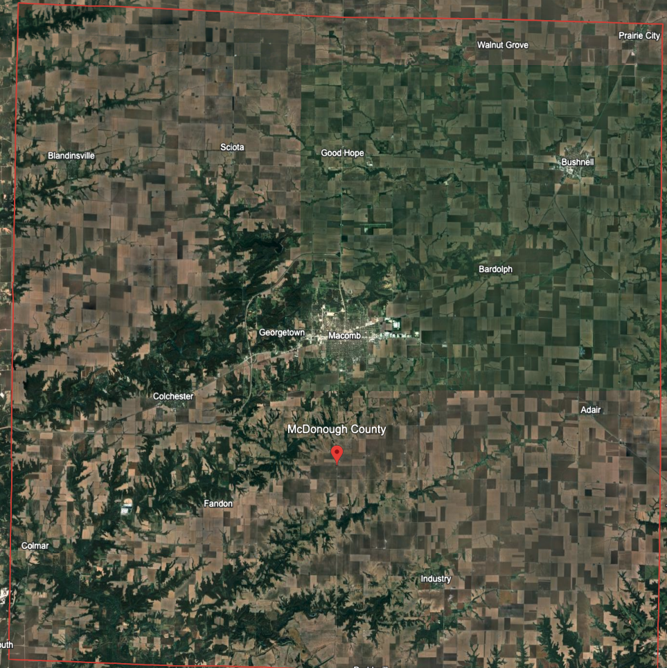
The county where I grew up, McDonough, in west-central Illinois, has lost 18% of its population since 2010. The grocery store I walked to as a teenager has been torn down and replaced with a laundromat and one of those gas stations where you can buy Bitcoin from an ATM. The church I attended has closed, and the (well-maintained) house I rented with roommates after high school is now appraised at just $31,000.
Housing prices are another sign of the difference between rural Illinois and Wisconsin. Figure 2 compares how home prices have changed in the metro and non-metro parts of each state since 2014.
In Wisconsin, prices have grown similarly in metro and non-metro counties, just about doubling over the past decade (these prices are nominal, or not adjusted for inflation). In Illinois, metro home prices grew 57%. In non-metro parts of Illinois they grew 33%, which is actually lower than the consumer price index over that period. In other words, average home prices in rural Illinois actually declined over the last decade on an inflation-adjusted basis, despite this being a decade when home prices nationally soared to record levels.

The demand gap between rural Illinois and rural Wisconsin is enormous. Some of this must be due to outdoor recreation, which is an important draw throughout Wisconsin counties and practically nonexistent in Illinois outside of the Shawnee National Forest.
Another formative difference between the two states lies, I believe, in the kind of agriculture each cultivates.
Agricultural Intensity vs. Agricultural Diversity
I am not an agricultural economist, but it seems to me that two important aspects for understanding how agriculture matters to a county are these. (1) How much of a county’s economy comes from agriculture and (2) how many different products contribute to a county’s agricultural output.
My hunch is that Wisconsin’s farming counties feature a broader mix of farm types than the standard Illinois trio of corn, beans, and a few hogs. The Wisconsin farming mix includes more labor intensive products like dairy and vegetables (including many commercial organic farms). This more diverse mix of farms supports more farmers and creates more hired positions, contributing more to the general health of rural communities than the large monocrop agricultural characteristic of the great plains states.
Figure 3 shows the Shannon index for agricultural commodity sales in each county. A higher score means that total commodity sales are more divided between many commodities, while a lower score indicates that a smaller number of commodities account for more of the total sales.

As I suspected, Wisconsin’s counties generally feature more diverse agricultural economies than average (shades of green), while Illinois’ are less diverse (shades of purple). Neither state includes the extremes on this metric. The counties with the least diverse agricultural economies are mostly in the deep south and the western great plains. These counties feature, respectively, concentrated poultry and cattle farms.
The most varied agricultural economies are scattered throughout the country with some concentrations in New England and Pennsylvania. Partly, this is because those areas have relatively little agriculture at all. What does exist is a variety of more artisanal forms of farming.
Figure 4 divides counties into four categories based on the total amount of agricultural sales in each. Dark purple counties have the lowest amount of agricultural production. Dark green counties have the most.
The nation’s most valuable agricultural land appear in several swathes. A midwestern band runs south of the North Woods from the Great Lakes west to, roughly, the 100th meridian. Other areas of particularly productive agriculture include California, Florida, and Oregon east of the Cascades.

Looking just at the 25% of counties with the most ag sales, here is how each county varies by agricultural diversity. In addition to being in the top quartile by sales, the dark green counties are also in the top quartile of ag diversity, while the dark purple counties are in the bottom quartile of ag diversity.
The difference between Illinois and Wisconsin is striking on this map. Both include many counties in the top quartile of agricultural production, but Wisconsin counties tend to be among the highest in terms of diversity of agriculture products while Illinois counties are among the lowest.

Consider the differences between two counties: McDonough in Illinois and Vernon in Wisconsin.
Vernon and McDonough are both home to roughly 30,000 residents, and aggregate agricultural sales are likewise similar between them. McDonough farmers reported $278 million in annual sales to Vernon’s $296 million. This placed the two counties in the 82nd and 83rd percentiles of total sales.
By contrast, Vernon scored in the 80th percentile of agricultural diversity to McDonough’s 35th. Vernon county farms sold at least $100,000 of 18 different commodities, compared to 6 in McDonough county.
In McDonough county, corn accounted for 53% of all ag sales ($146 million), followed by soybeans at 32% ($88 million), hogs at 12% ($33 million), and cattle at 2% ($6.7 million). The only other products with at least $100k in sales were “other field crops (including hay)” at $1.68 million and sheep at $257k.
The largest commodity in Vernon county was milk at $135 million or 46% of the total. Corn came second with 18% of sales ($54 million), followed by cattle at 14% ($41 million), and soybeans at 9% ($26 million). Further commodities making up at least a percentage point of total sales were poultry (including eggs) at 5%, other field crops (including hay) at 4%, and vegetables at 1%. Vernon county farmers sold $3.9 million of vegetables in a year.
Here are the other commodities Vernon county farmers sold in quantities of at least $100k: fruit & tree nuts, $1.86 million; equine livestock, $852k; hogs, $794k; wheat, $721k; berries, $688k; other grains, $506k; sheep, $488k; maple syrup, $307k; tomatoes, $247k; goats, $185k; bedding plants, $182k.
Vernon farmers also sold $70k of christmas trees; $68k of mushrooms; $34k of potted, indoor flowering plants; and $23k of honey, to name a few other minor products.
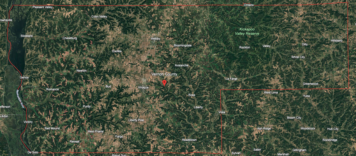
Despite the overall similarity in total agricultural sales, there are far more farms, farm operators, and farmworkers in Vernon county than McDonough county. The 2022 census counted 658 farms in McDonough county to 1,810 in Vernon.
The USDA Ag census distinguishes between farm “producers” who make decisions about operating the farm and farmworkers who are hired for specific tasks. McDonough county’s farms included 2,345 producers to Vernon’s 7,398.
The farms in McDonough county hired 544 farmworkers for any length of time, compared with 1,553 employees in Vernon county.
On a per hired farmworker basis, McDonough county farms employed 1 person for every $511,864 in agricultural sales. In Vernon county, the ratio of ag sales to farmworkers was $190,302.
Two pictures of farming emerge. In McDonough county, a smaller number of large farms grow enormous quantities of corn and soybeans with little need for employees. The hog farming that remains is in CAFOs.
In Vernon county, the biggest single commodity is milk, which is a far more labor-intensive product. But the rest of the agricultural economy is also split into a larger range of products, many of them also more labor intensive than standard row crops. More farms exist, employing more farmers and farmworkers, likely with concomitant positive effects on the rest of the county.
Why has Vernon county retained more small farms growing and raising a more diverse mix of crops and animals than McDonough county, some 200 miles south? A partial answer lies, I suspect, in the topography of the two counties. McDonough, like most of Illinois, is flat.
The land lends itself to enormous corn fields. When the land behind my childhood home went on the market, a larger farmer bought adjacent fields and simply plowed under the hedgerows. The new field is 240 acres–enough to constitute an entire good-sized farm when my grandfather was young. In fields this size, the economic logic of corn and soybeans is obvious.
Labor inputs are minimal and shrinking. When I was a teen, farmers I knew were buying tractors with GPS-guided steering. They still had to turn the tractor at the end of each row, but machine could automatically steer itself down the straight lines of a cornfield. Earlier this year, John Deere announced new autonomous technology which will allow tractors to till a field without a person in the cab at all. The benefits of labor-saving innovations like these compound on larger fields with simple-to-process crops.
Southwestern Wisconsin is not flat. Part of the unglaciated Driftless Area, counties like Vernon appear dendritic from above, like the branches of a tree. They are scored with deep river valleys called “coulees” separated by irregular ridges. It makes sense to me that such a varied landscape would sustain a wider mix of farms. The consolidation of farms common on the plains of Illinois is just physically more difficult in the Driftless where fields are often smaller, scattered, and oddly shaped.
Now, for your enjoyment, here are maps showing where American farmers grow or raise the country’s top-20 agricultural commodities. Click to expand.


.svg)


-&-(MULES-&-BURROS-&-DONKEYS).svg)


