A case study on the limitations of maps
The Milwaukee metro area is quite possibly the most politically segregated metropolis in the United States.1 This is part-and-parcel an outcome of the region’s extreme racial segregation. Depending on the story you want to tell, it’s easy to find statistics to spin in the direction you want. But even if you aren’t trying to spin the facts, it’s difficult to find a short way to tell the whole story.
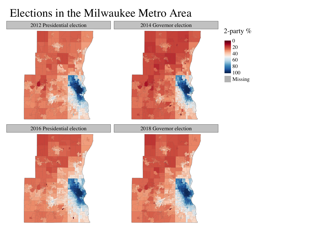
Consider these two ways of mapping elections. The first uses a 6-category binned color palette. The second uses a continuous color scheme. Both reveal useful patterns, but obscure others. And, of course, both maps have the inevitable fundamental flaw of all choropleth maps–land does not equal people.
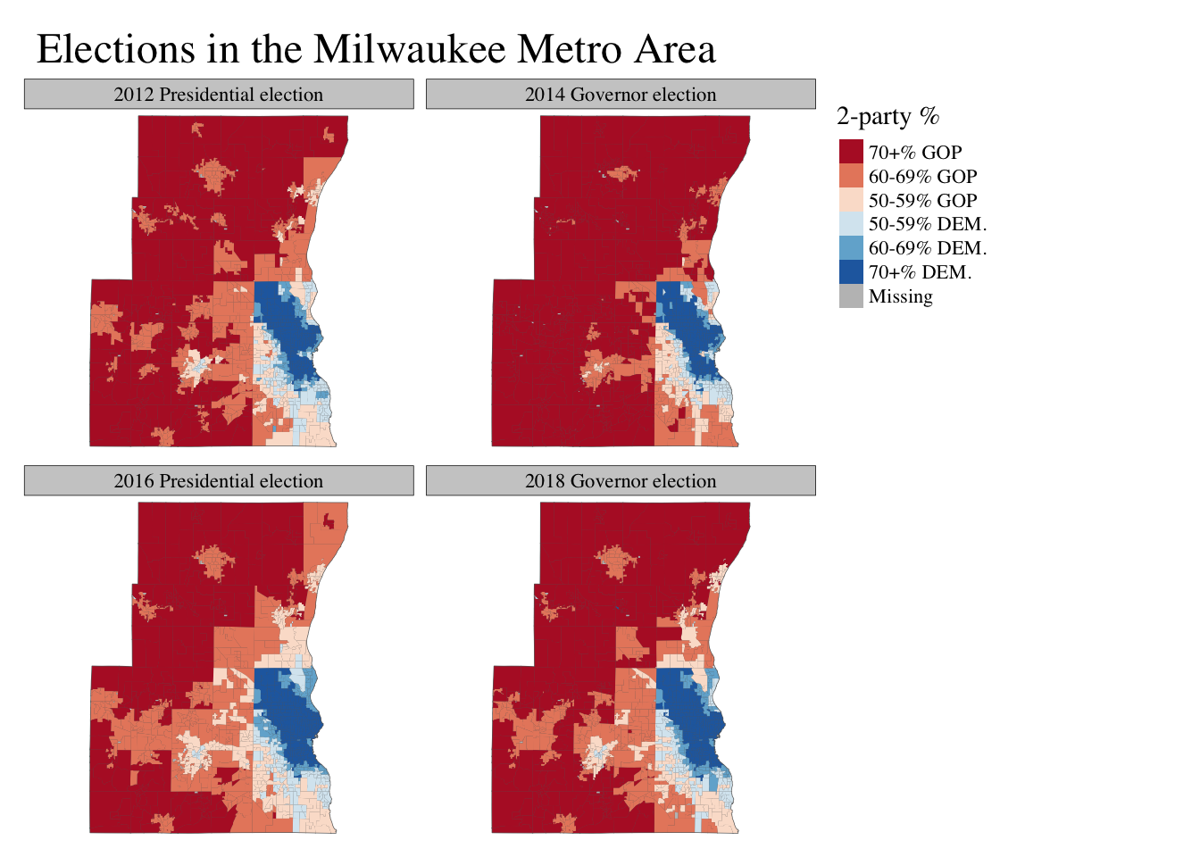
I think the binned data does a better job communicating how polarized the region is. The WOW counties are genuinely very Republican. The dark red colors on the binned map do a better job of showing the heavily Republican nature of the suburbs than the washed out reds in the continuous map. On the other hand, they suggest symmetry with the City that doesn’t exist. While solidly Republican, the suburbs are not as uniformly partisan as vast swathes of Milwaukee proper.
There are 16 wards (with at least 10 voters) in the suburbs which average 80% or more of the vote for Republican candidates. There are 189 such Democratic-leaning wards. Republicans in the suburbs are much more likely to have Democratic neighbors than the inverse of Democrats in the city. The continuous map captures this asymmetry well.
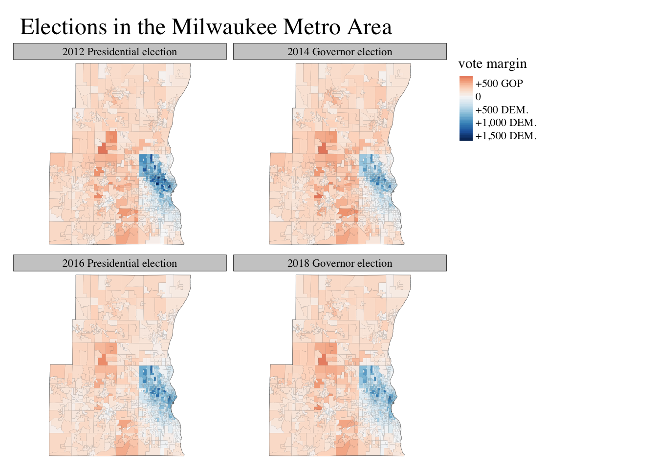
Here is one more version of the map. In some respects, this is the most accurate map. It simply shows the raw vote margin–how many votes the winner got–in each ward using a continuous color scale. This helps to even out the overrepresentation of highly Republican but sparsely-populated rural areas, but the changes from one election to another are not obvious in this map.
This emphasizes an important point. In reality, the voting changes from one election to the next, even when electorally significant, are usually pretty small. But we don’t look at election maps to be reminded of that. We look at maps to see the places where change happened. Because of this, the most descriptively accurate maps are often the least informative.
See this excellent bit of reporting by Craig Gilbert and funded by my employer, the Marquette Law School.↩