National rainfall maps
Fri, Sep 14, 2018
1-minute read
This maps shows 2018 year-to-date rainfall compared to the normal amount (as calculated by NOAA from 1981-2010). Counties colored blue have received more than the usual rainfall so far. Red counties have received less.
If you’d like to replicate the first map, check out the code. Warning: it takes a long time to run.
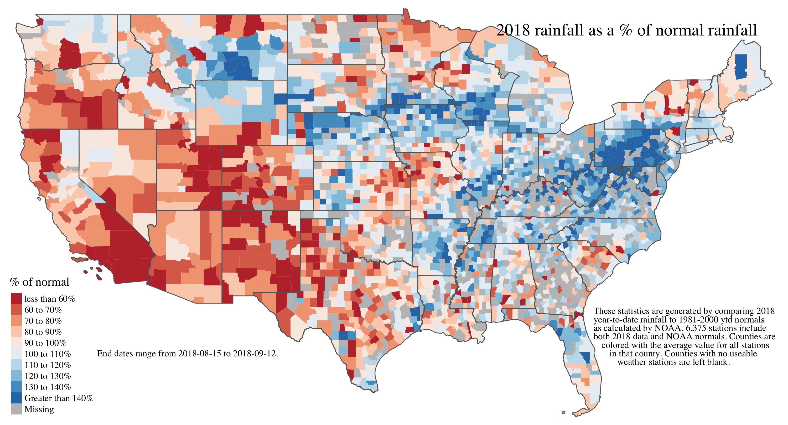
After making this county-level map, it occured to me that political boundaries might not be the best way to represent this sort of natural phenomenon.
Here is another version of the map, but this time the geographic level used are watersheds.1
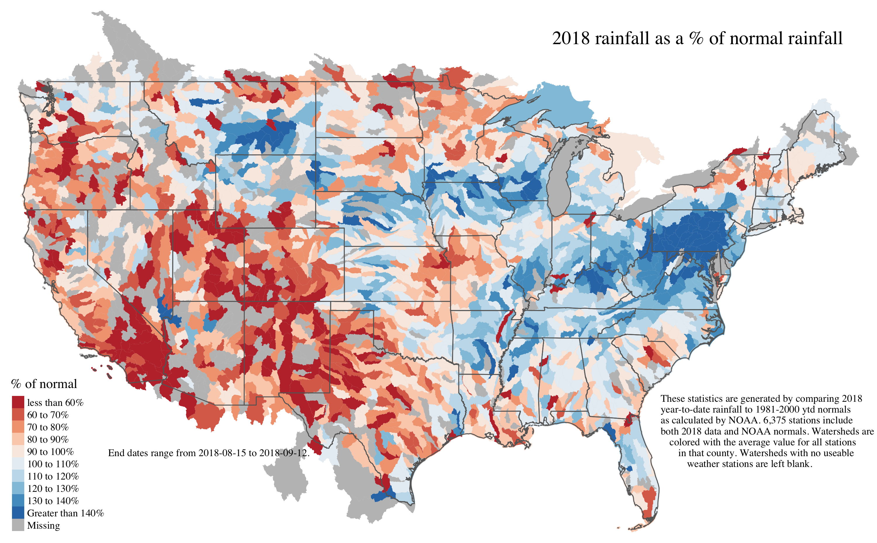
Technically, I use 8-digit Hydrological Unit Codes, not watersheds because they are too small for the available NOAA data.↩