Vote and seat shares across 21 democracies
These charts show the results of elections in 21 democracies from 1950 to 2011.1
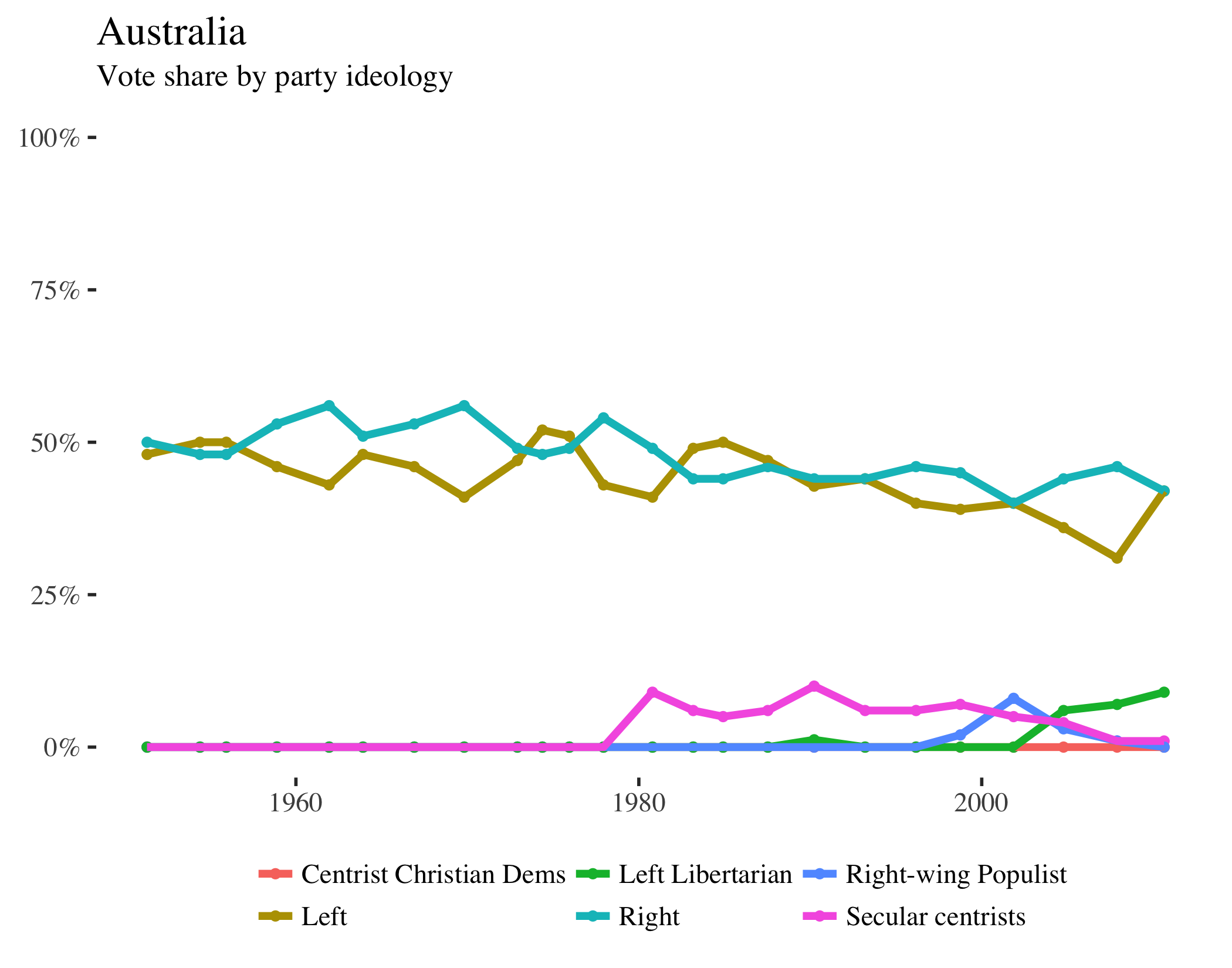
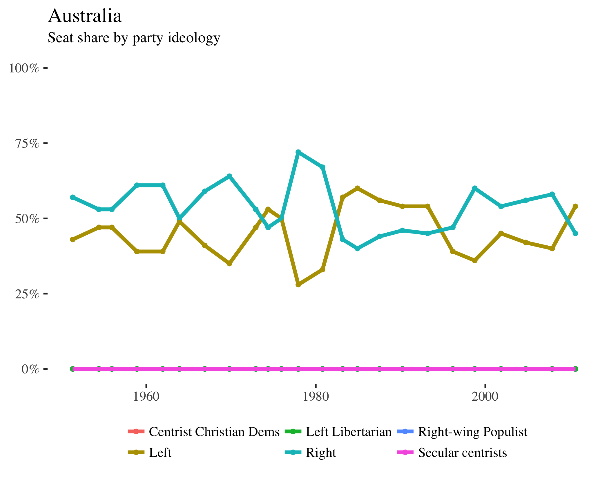
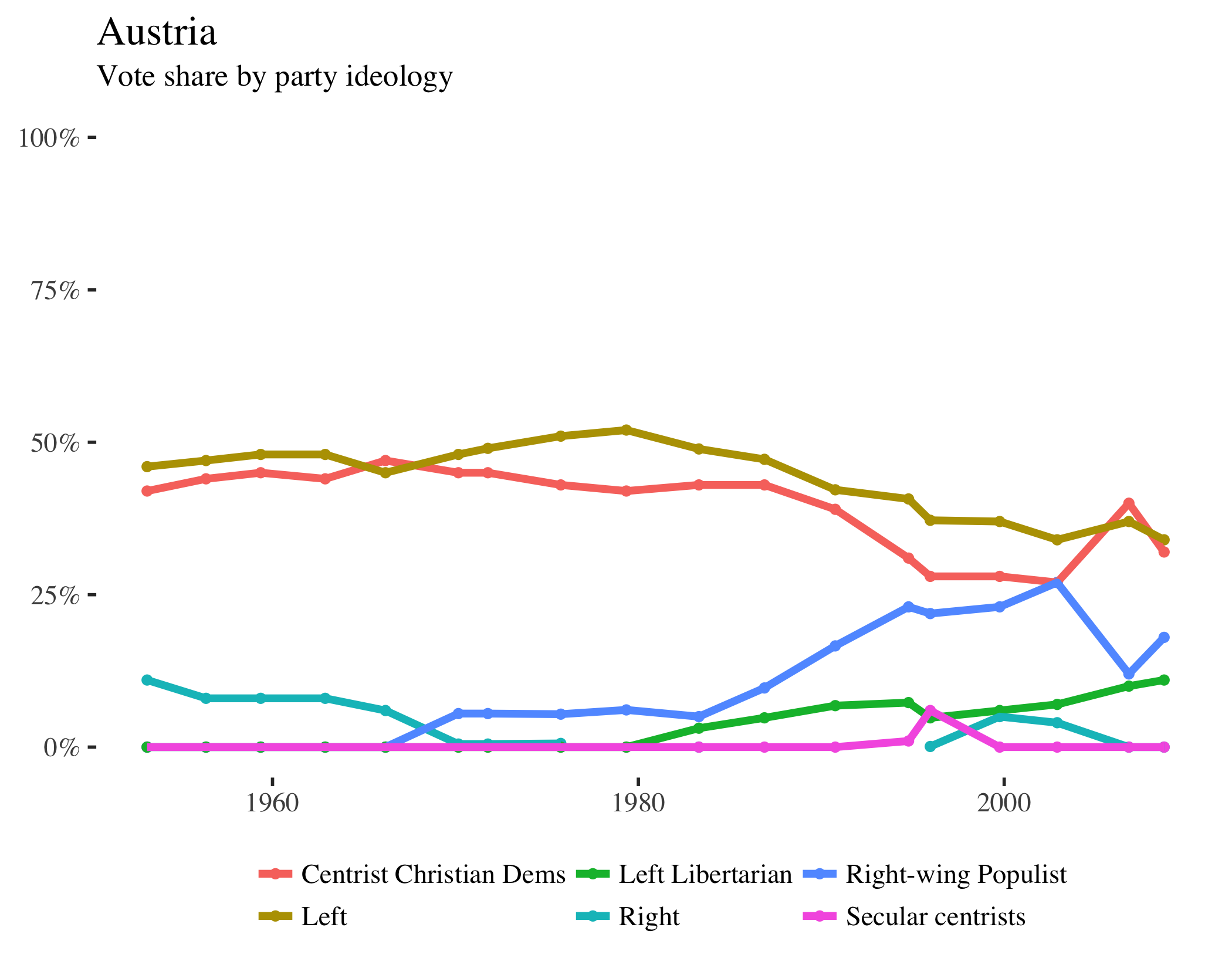
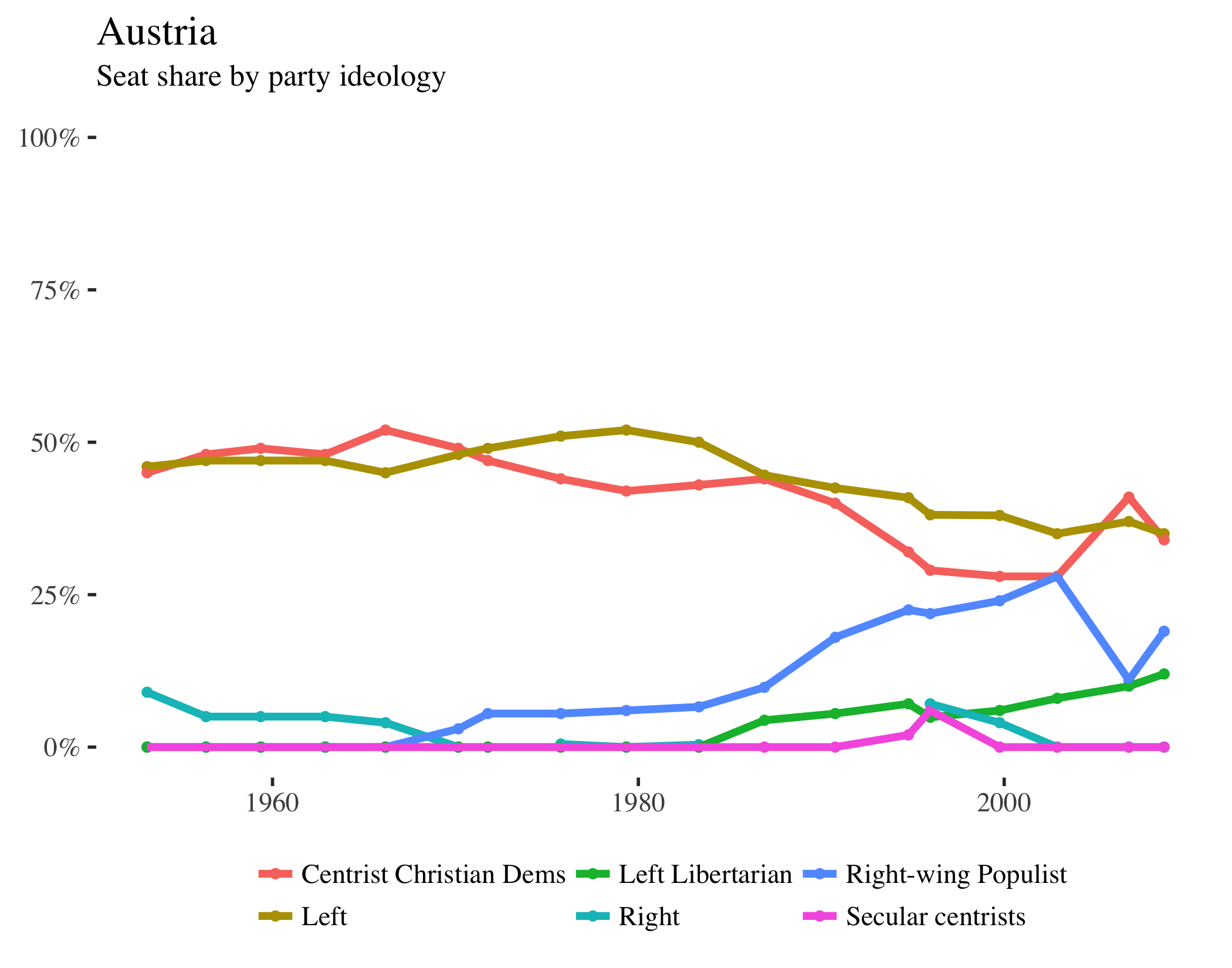
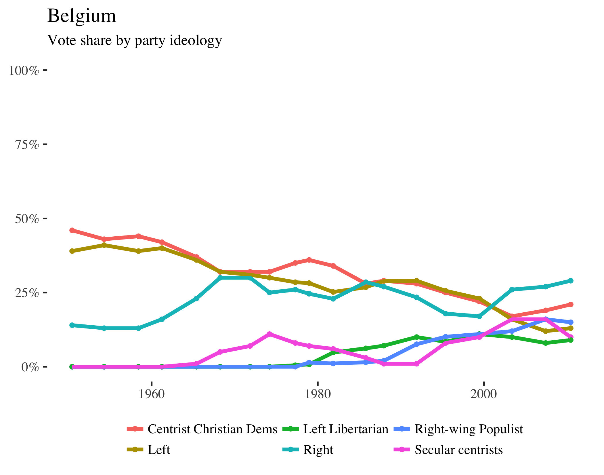
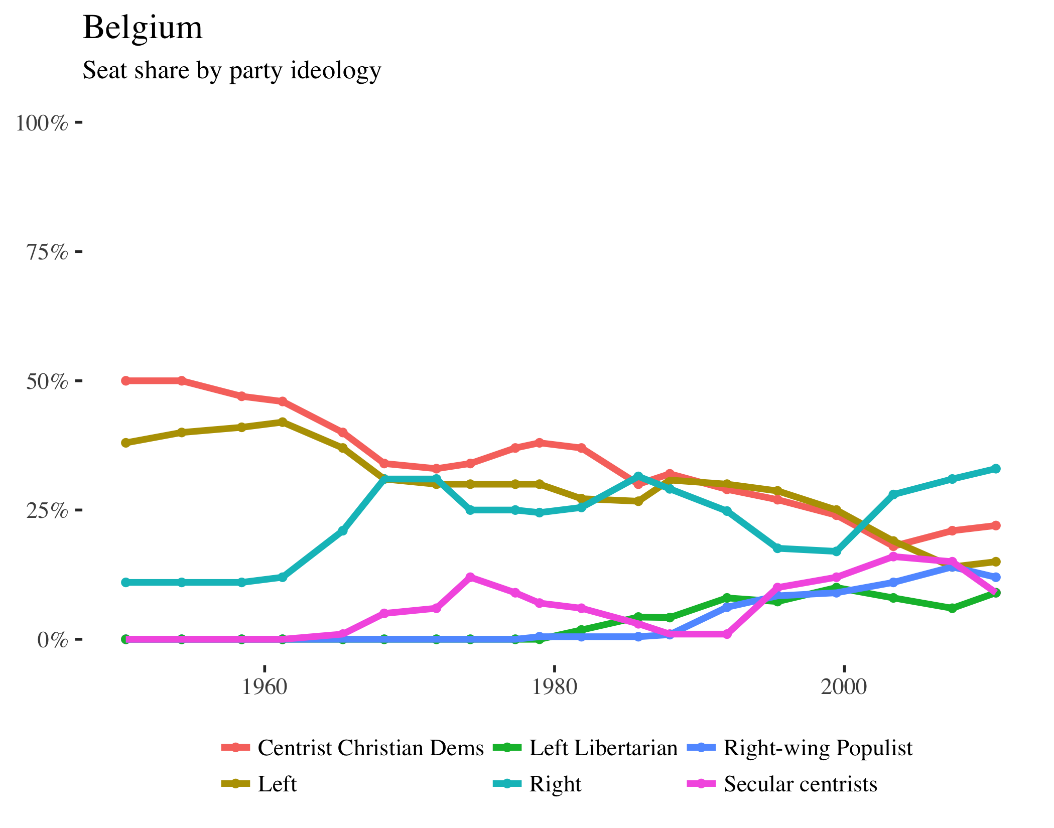
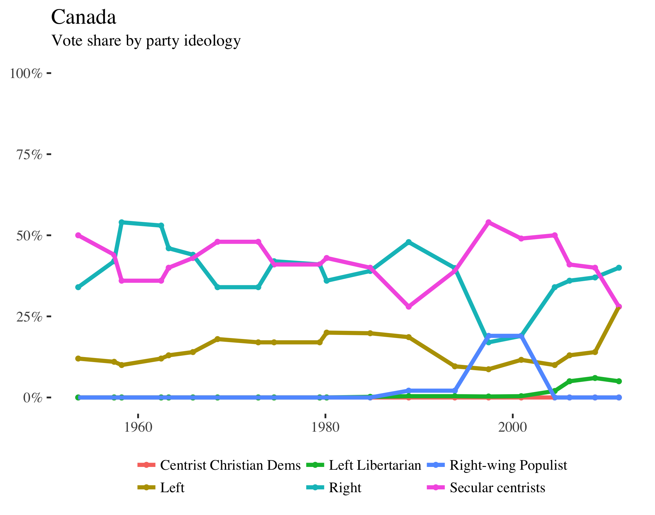
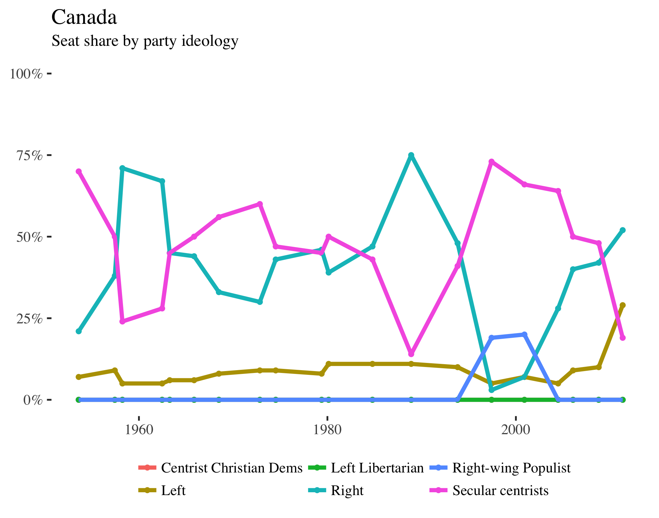
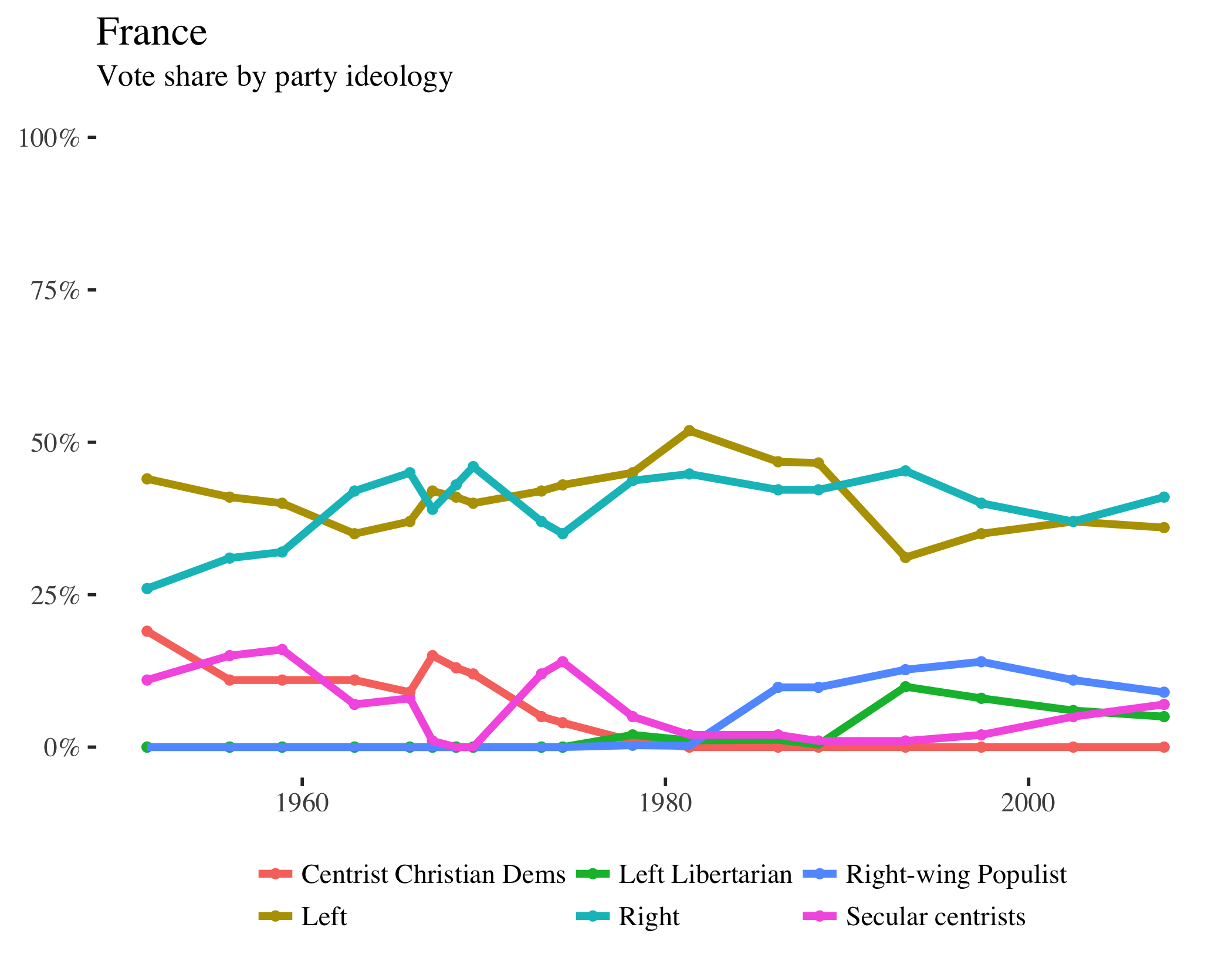
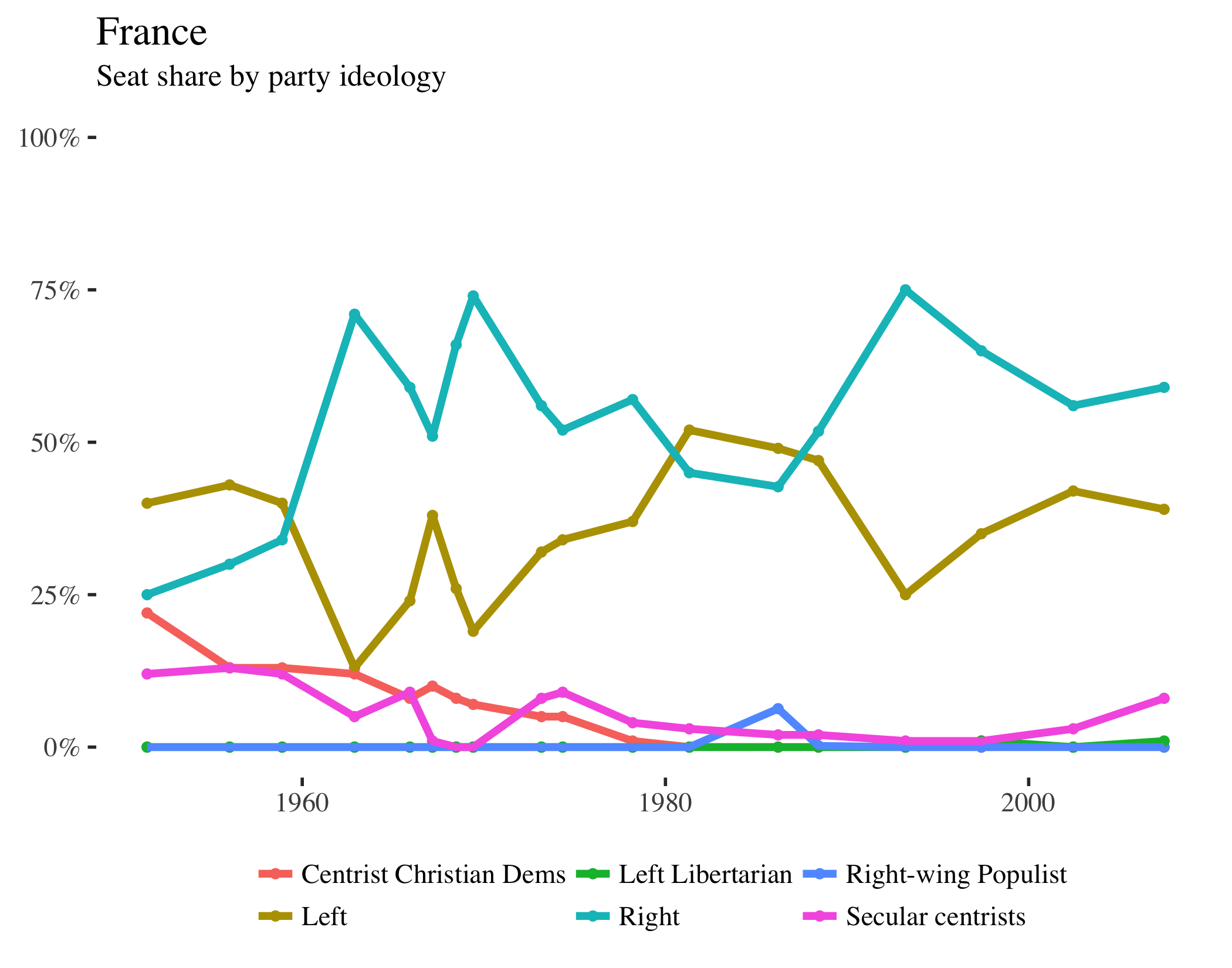
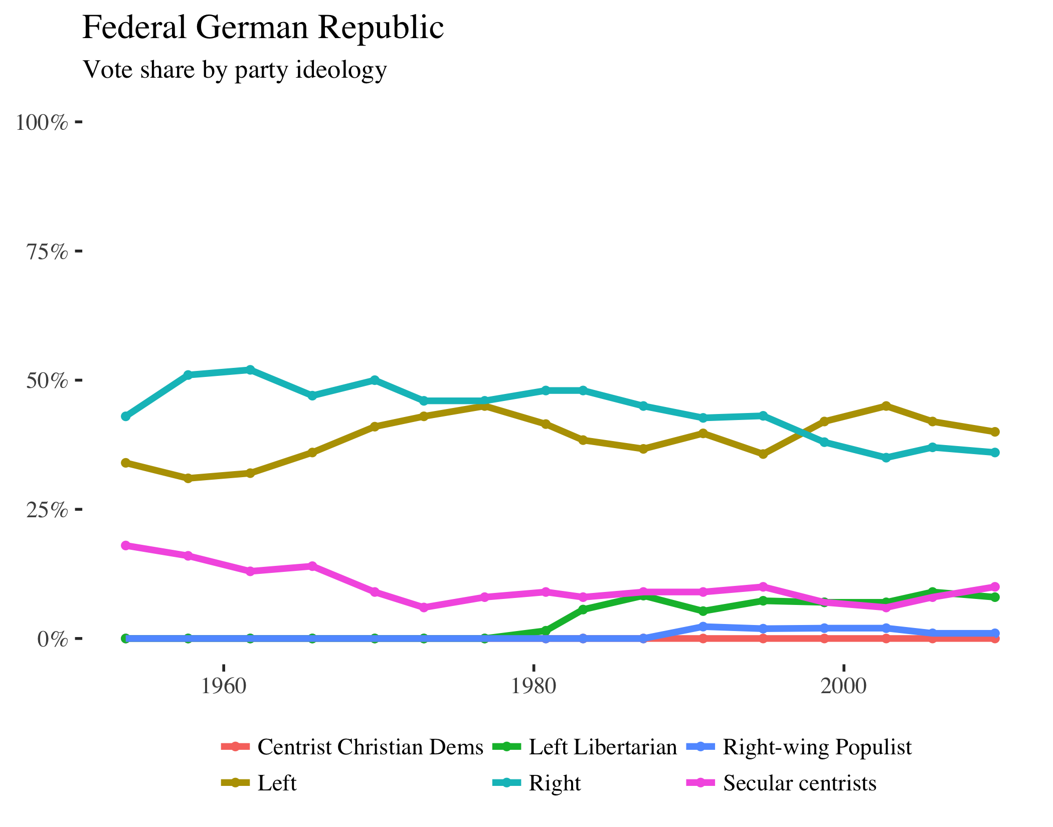
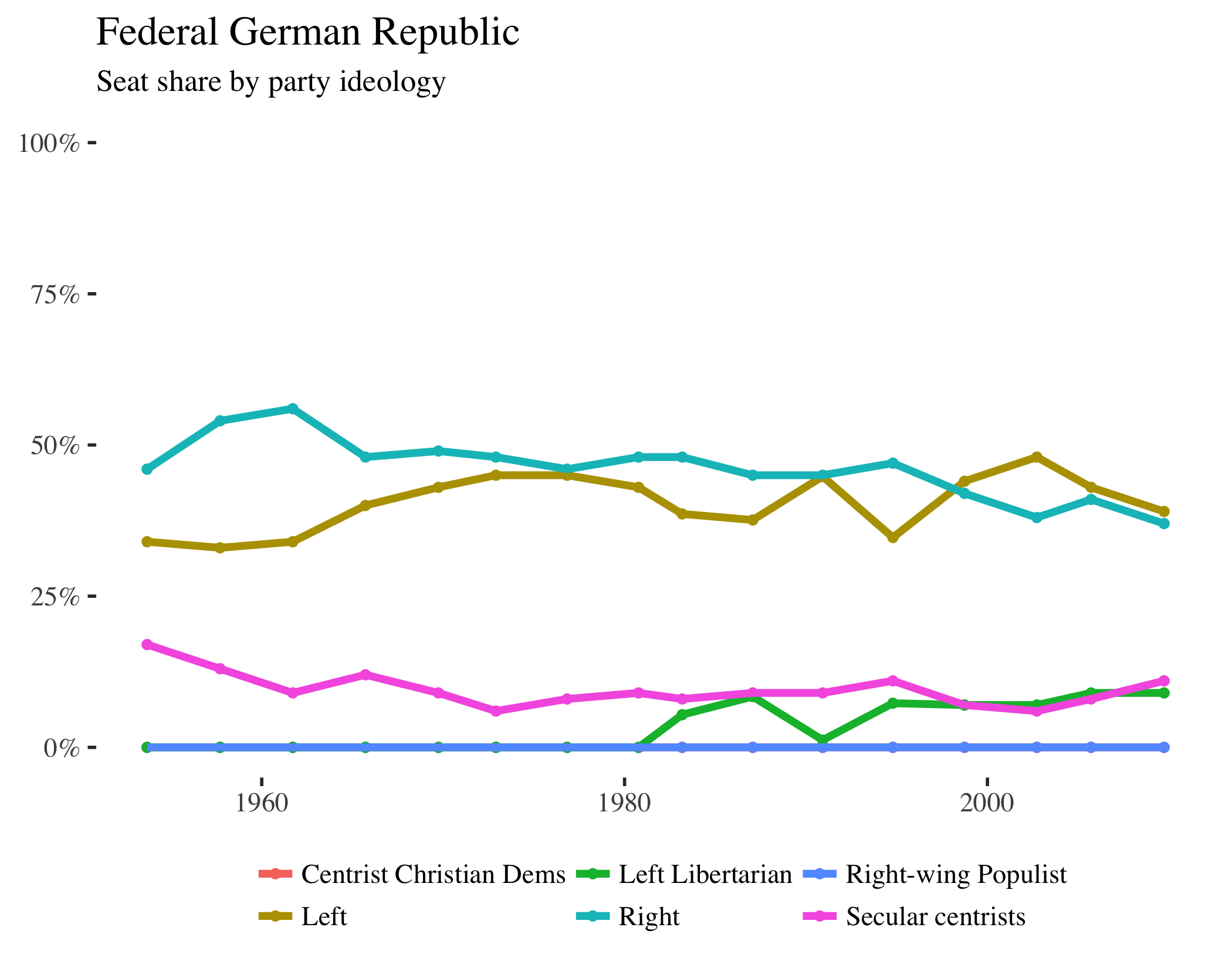
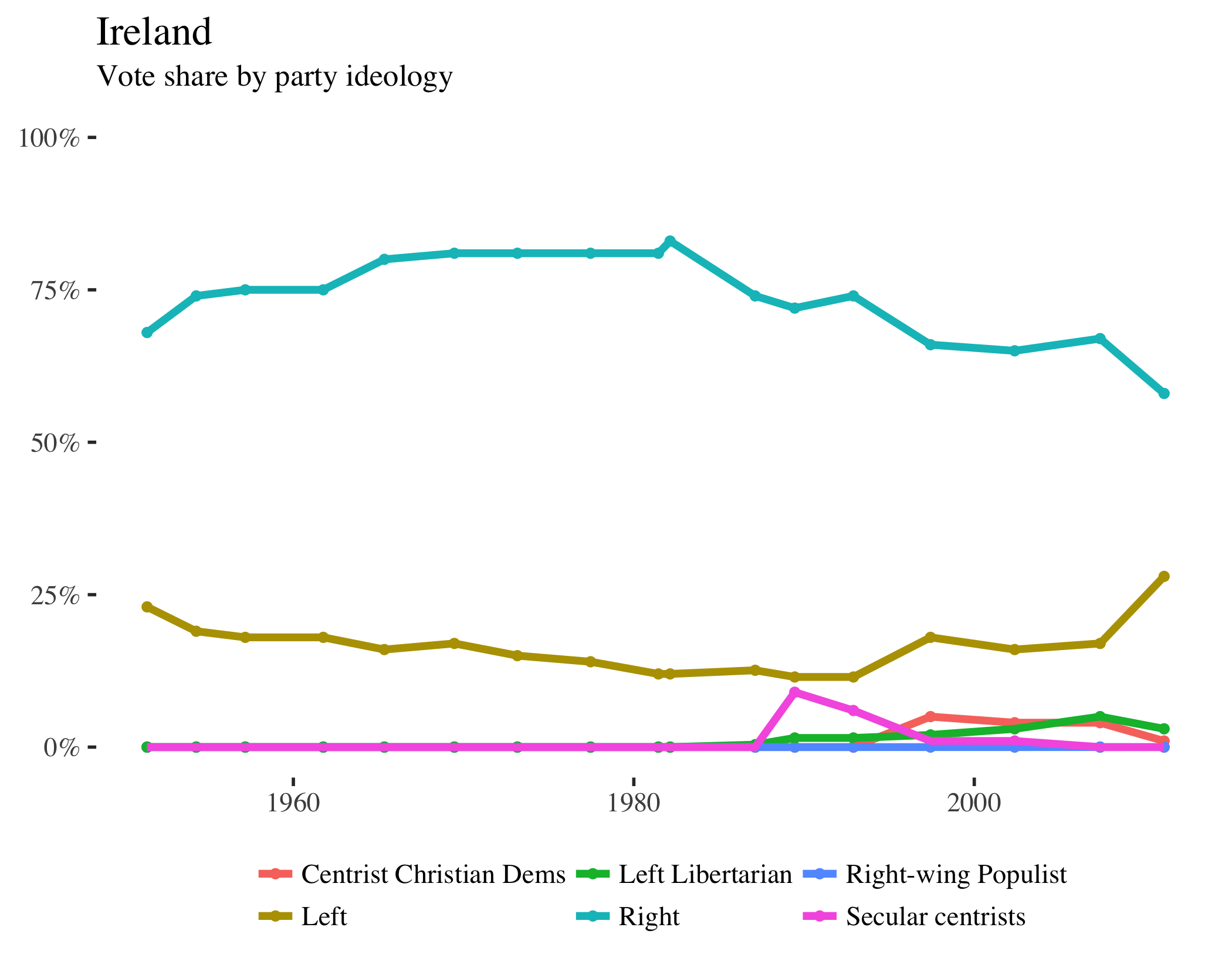
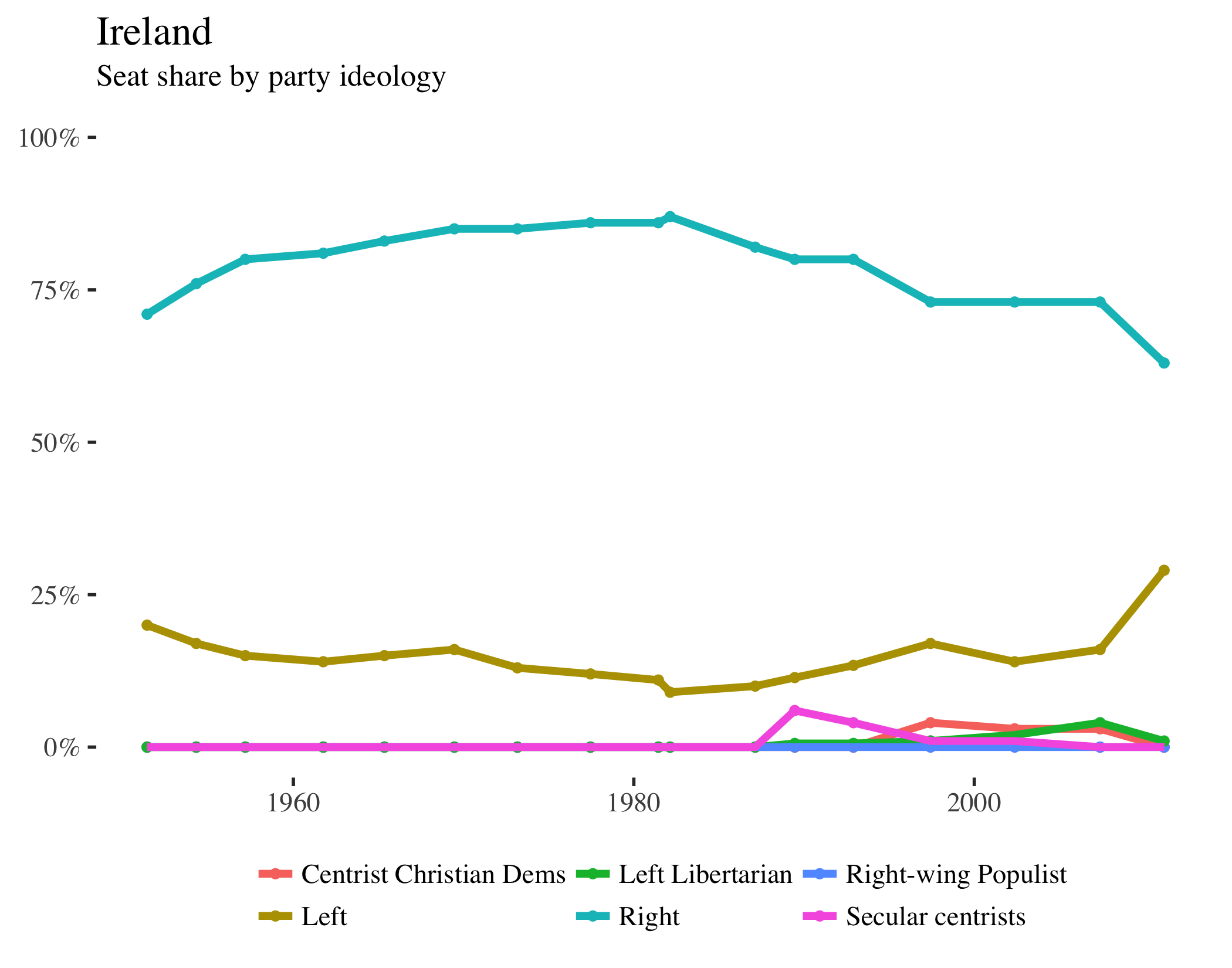
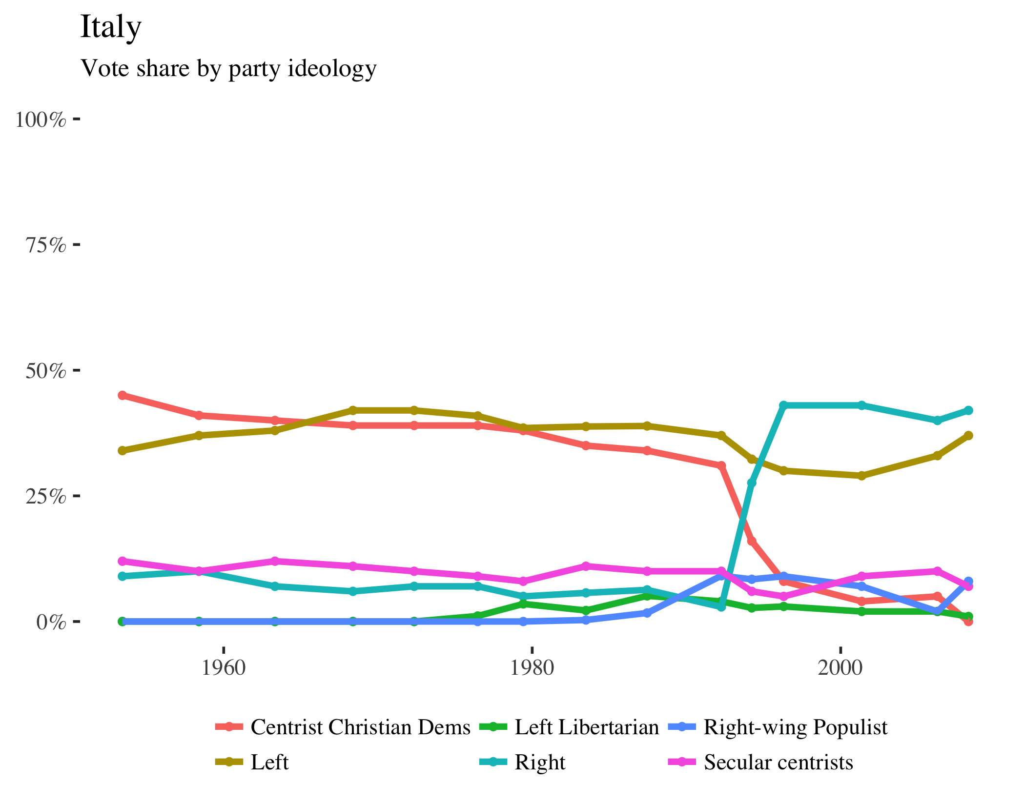
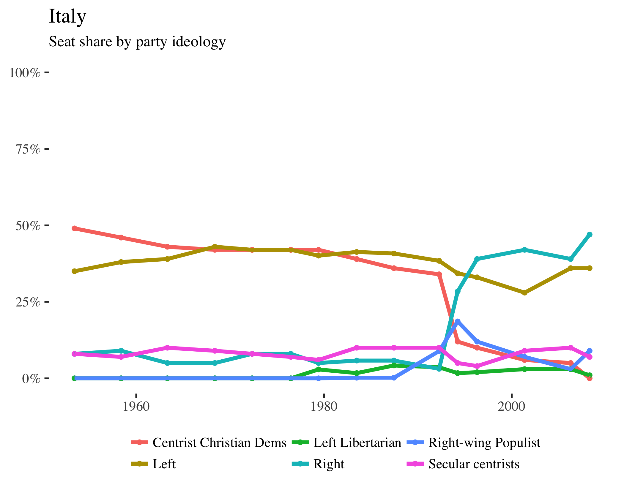
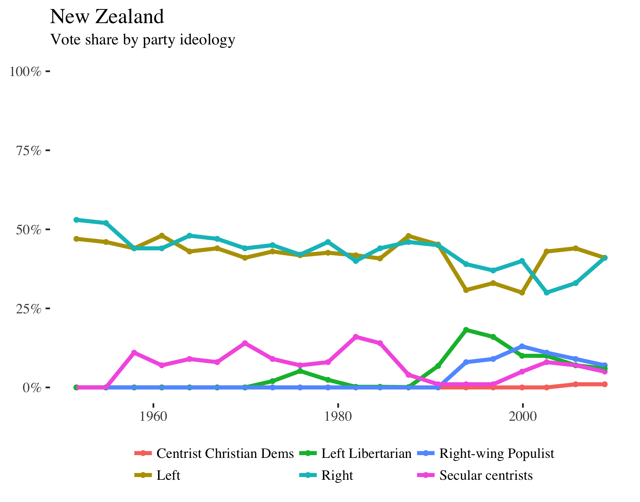
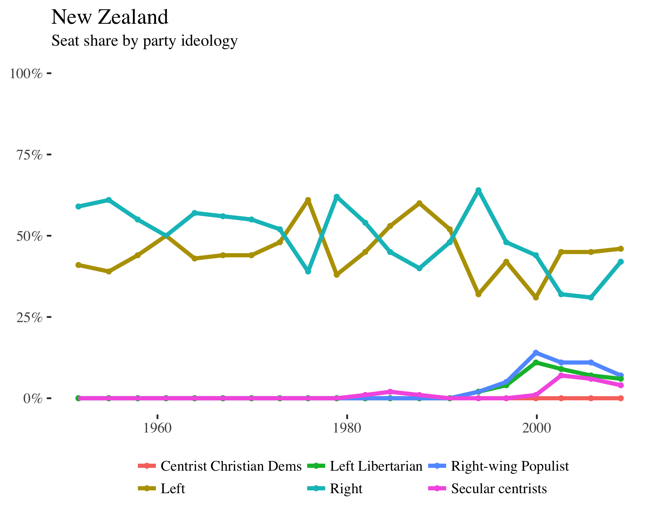
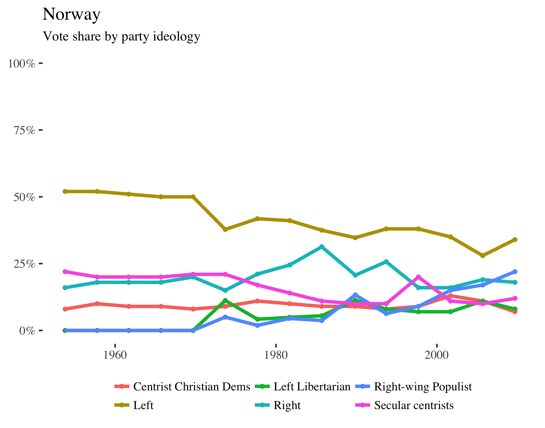
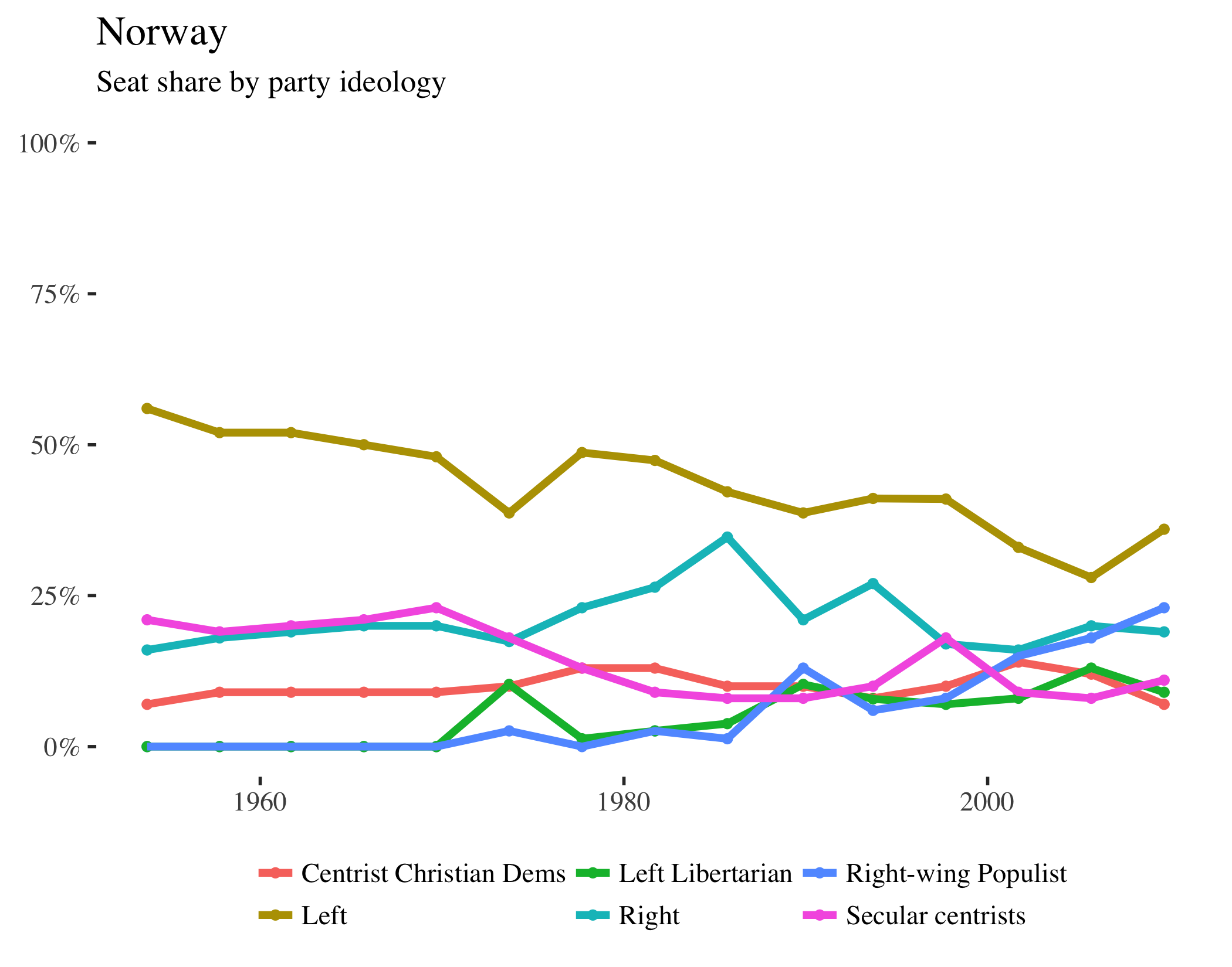
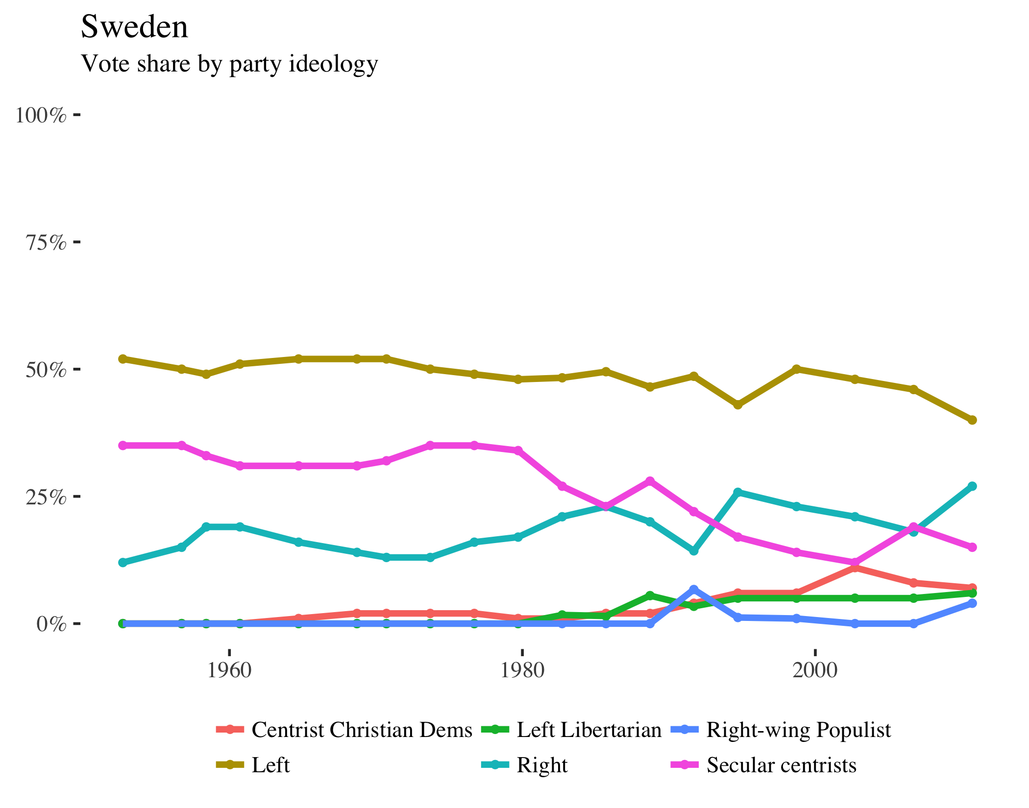
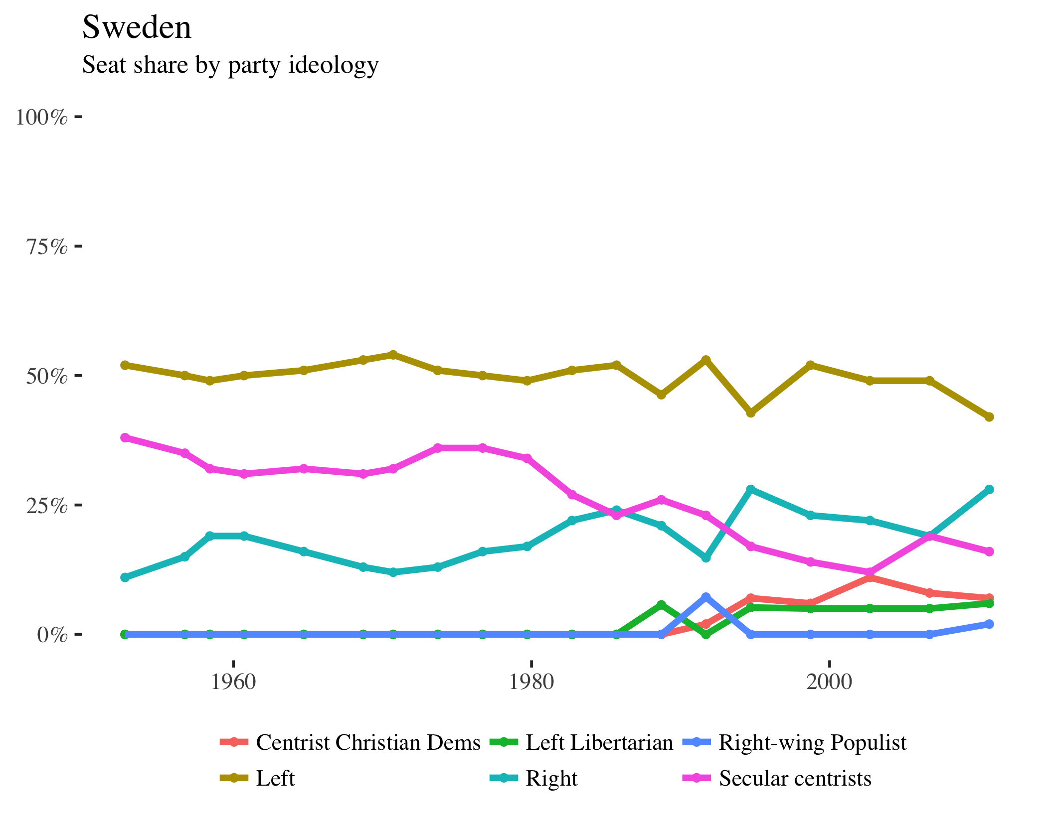
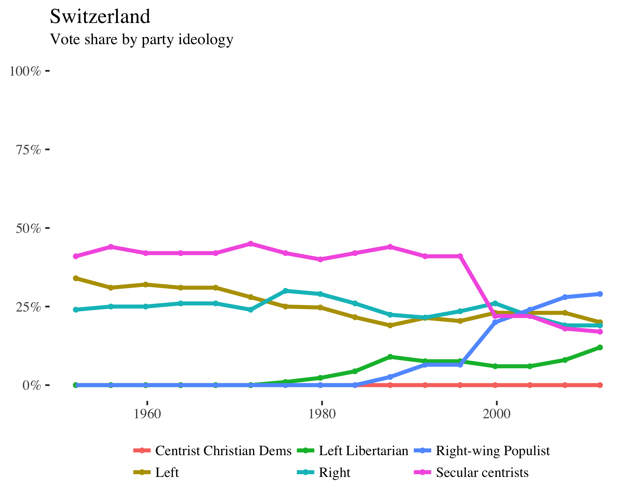
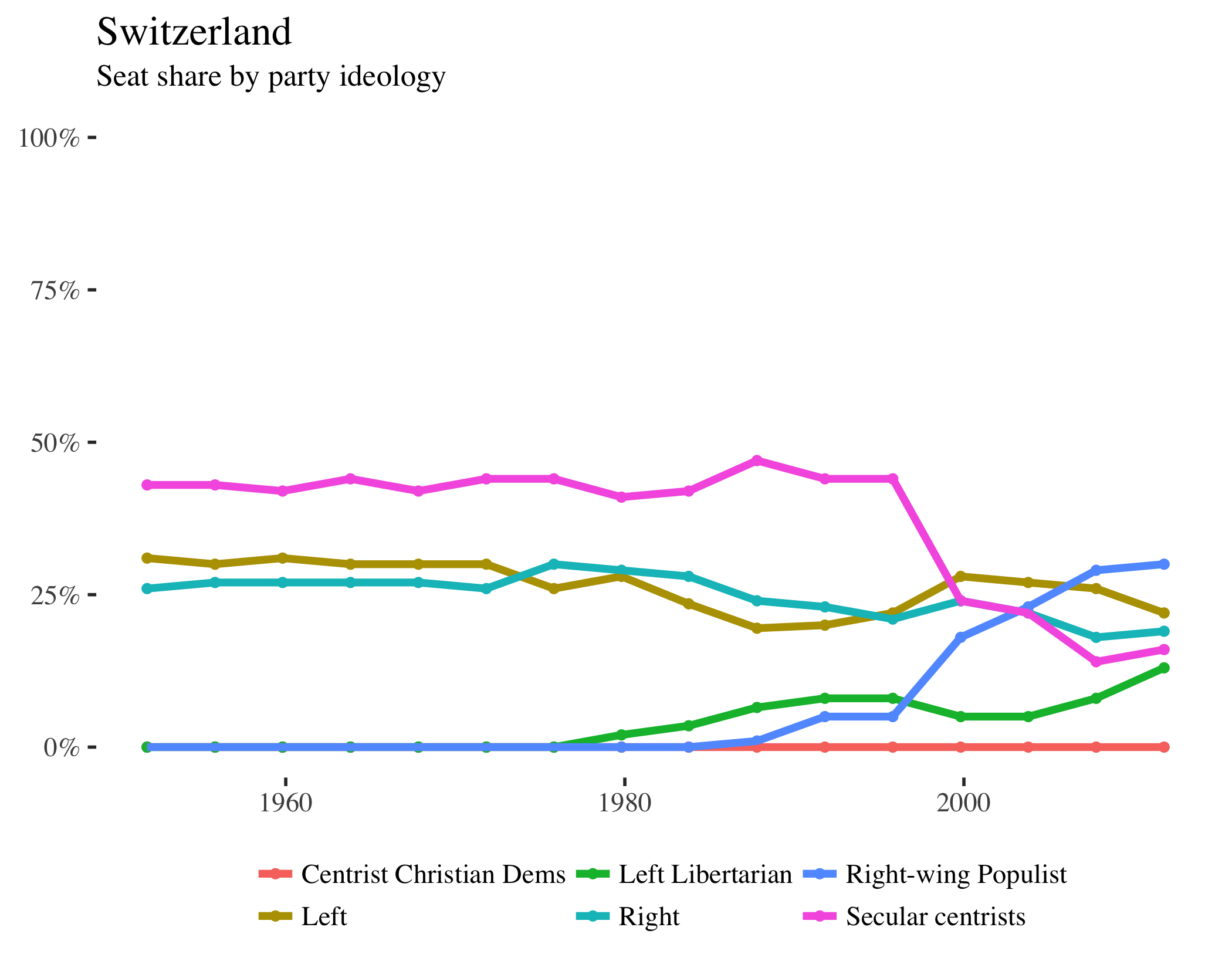
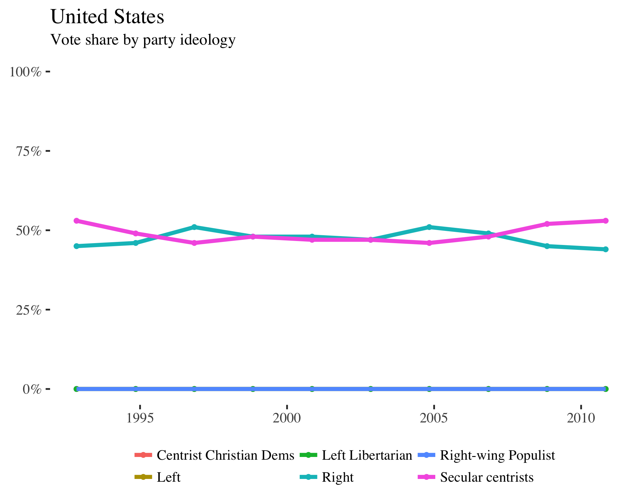
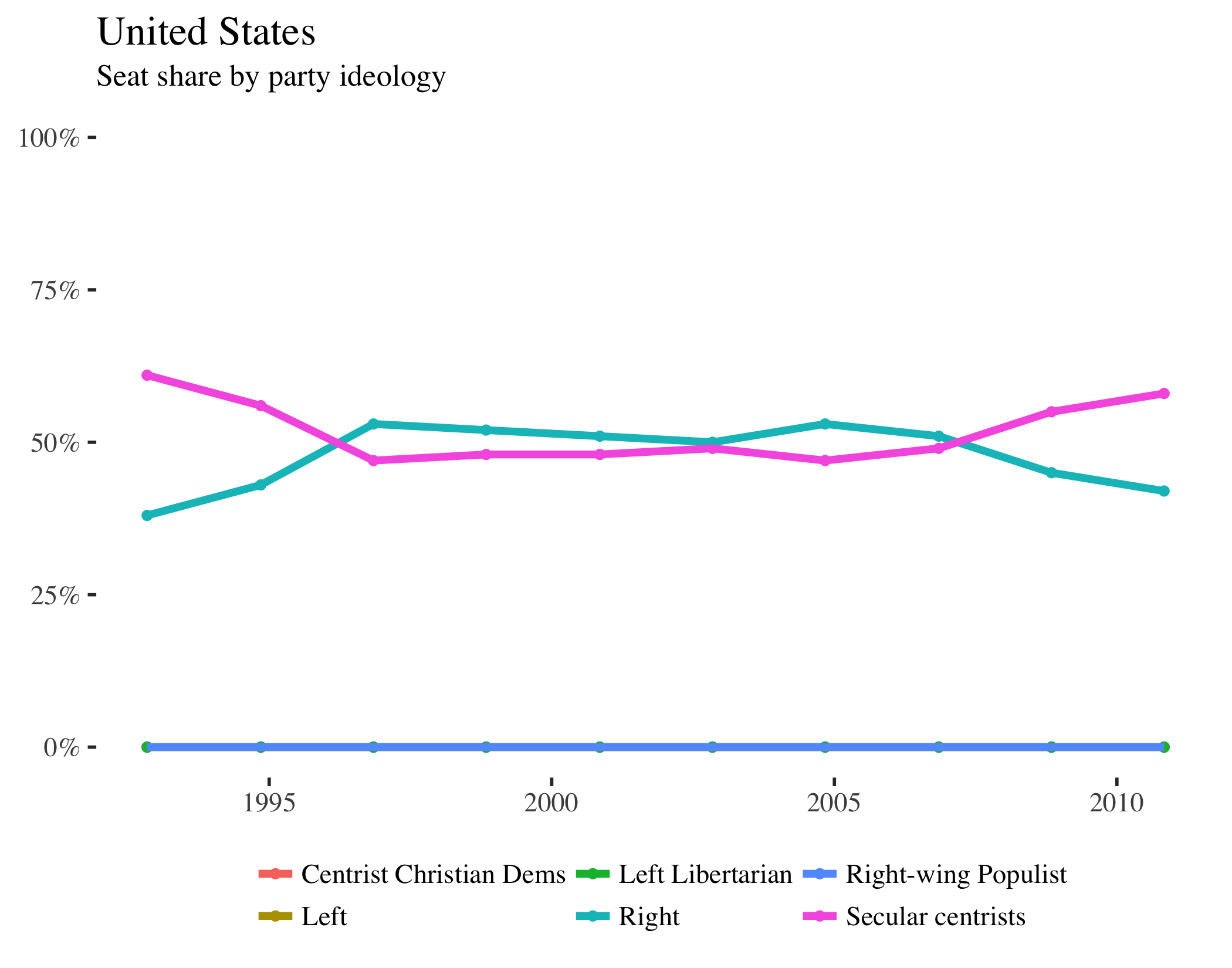
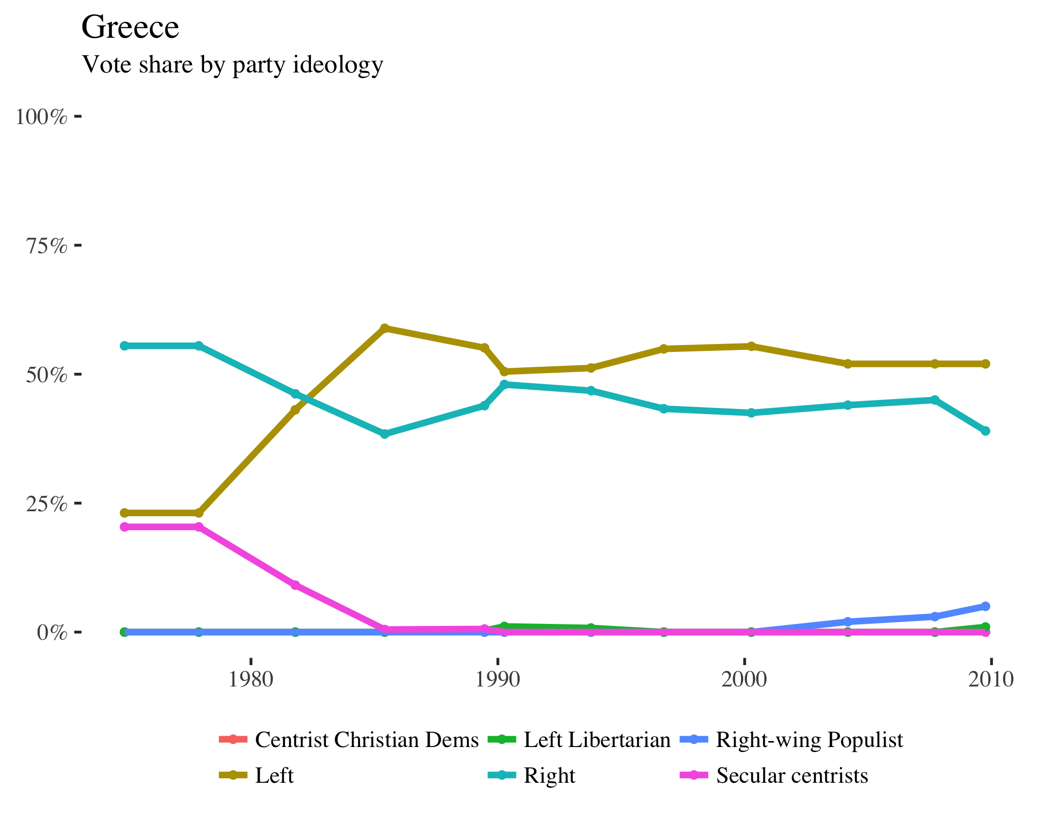
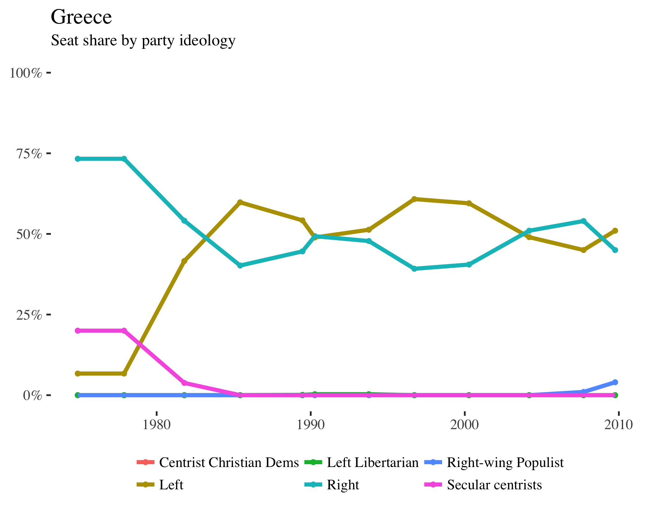
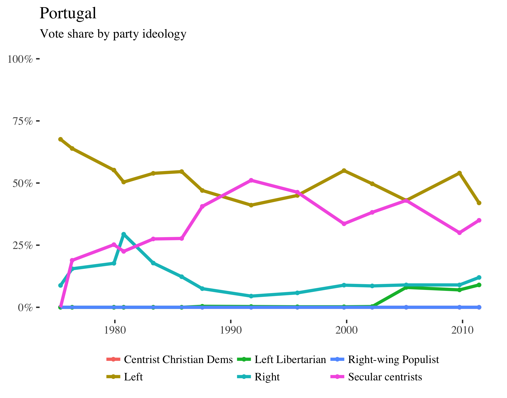
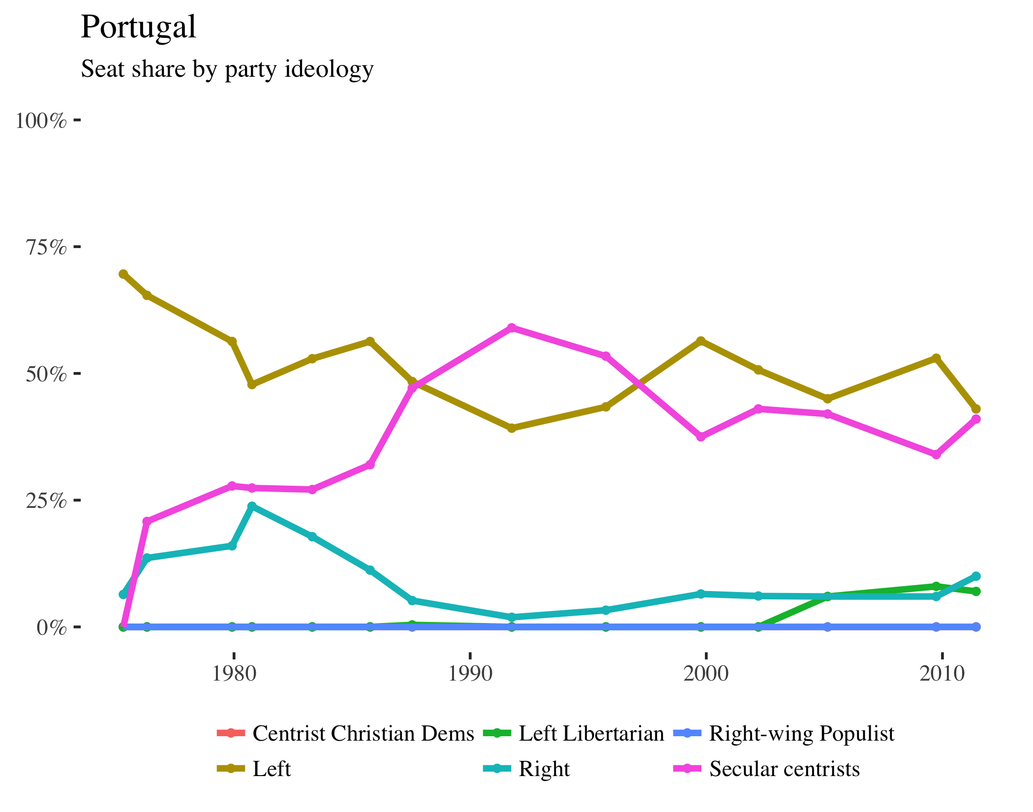
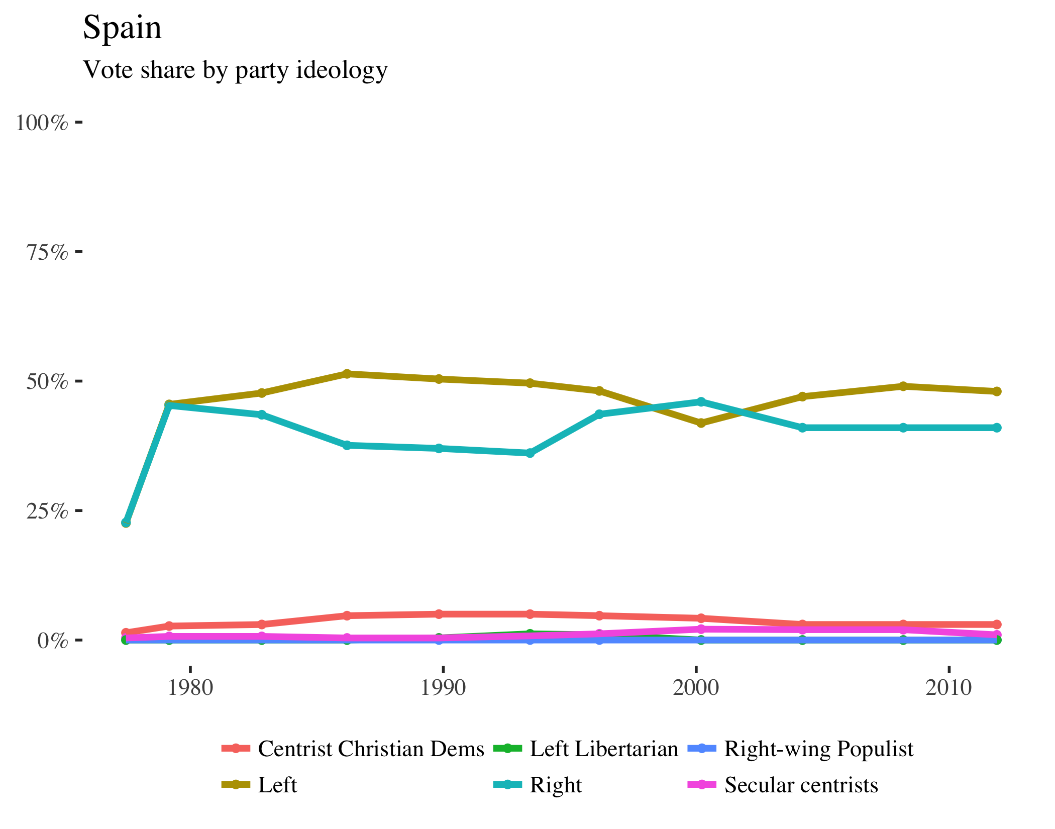
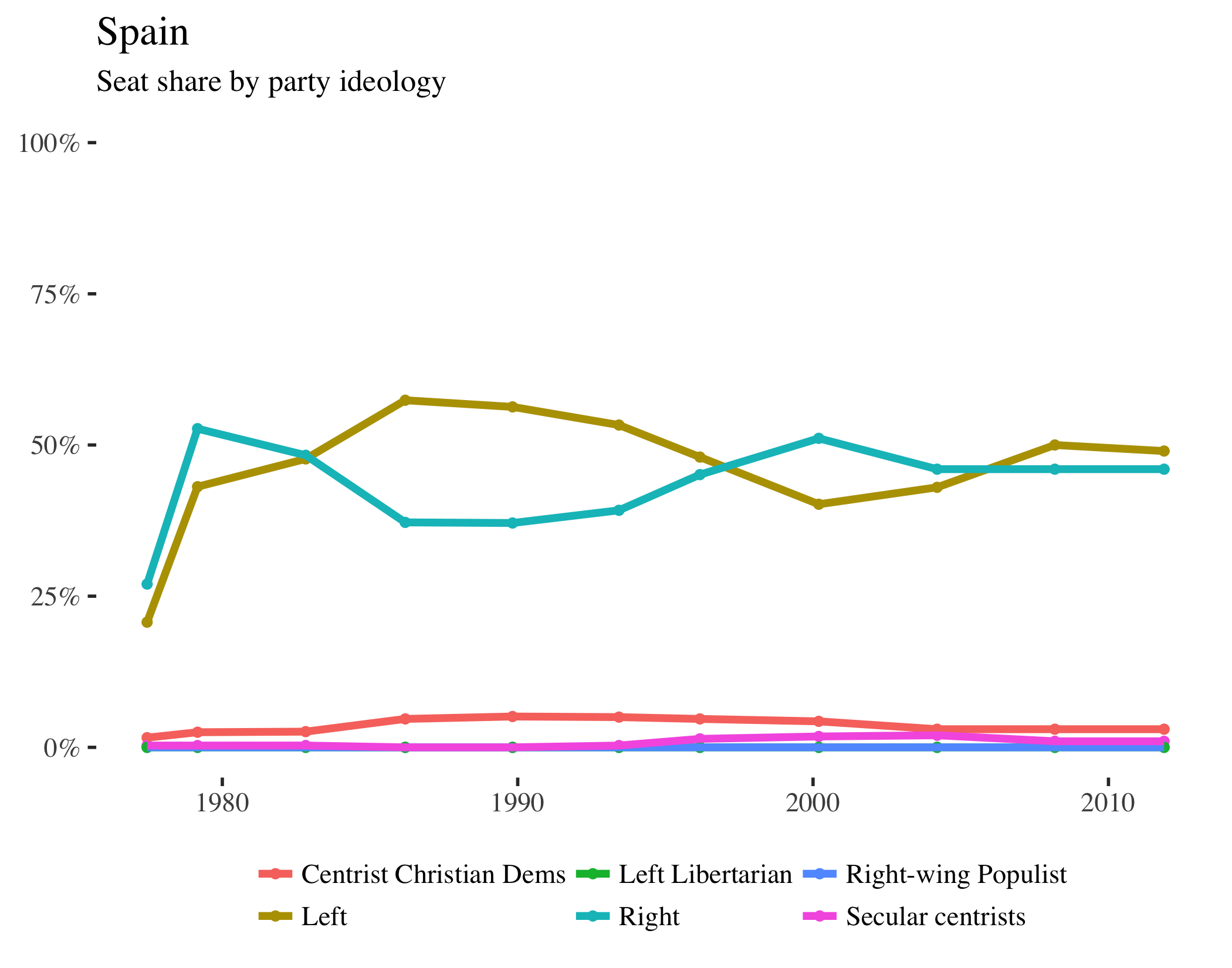
The left graph in each pair shows the share of the vote received by parties of each ideological grouping–left, right, centrist Christian democrat, secular centrists, left libertarian, and right-wing populist. The right graph shows the seat share for those parties (in the lower house, if bicameral).2
Viewing these graphs side-by-side reveals not just changes over time, but also the varying ways different political systems translate votes into seats. Notice that some countries give the winner remarkably more seats than their vote share would indicate, while the apportionment of seats in other countries closely mirrors the election results. This is often due to the differences between first-past-the-post voting and proportional representation.
The dataset used to make this was created by Duane Swank, who has generously made it publicly available. If you’d like to replicate these graphs, check out short, annotated example R script.
Australia
Austria
Belgium
Canada
Denmark
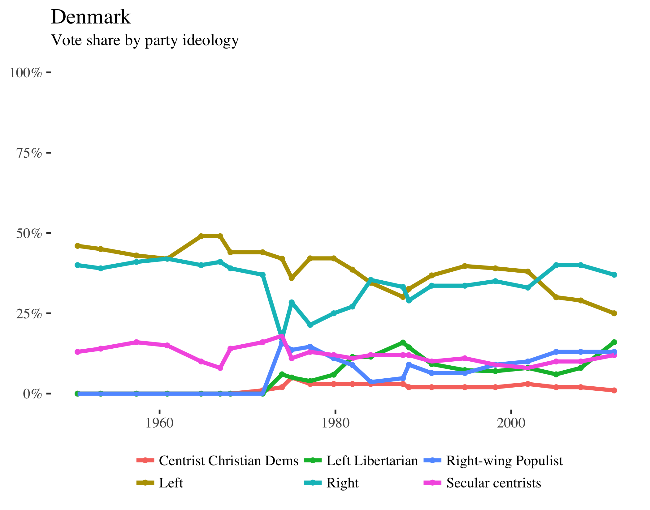
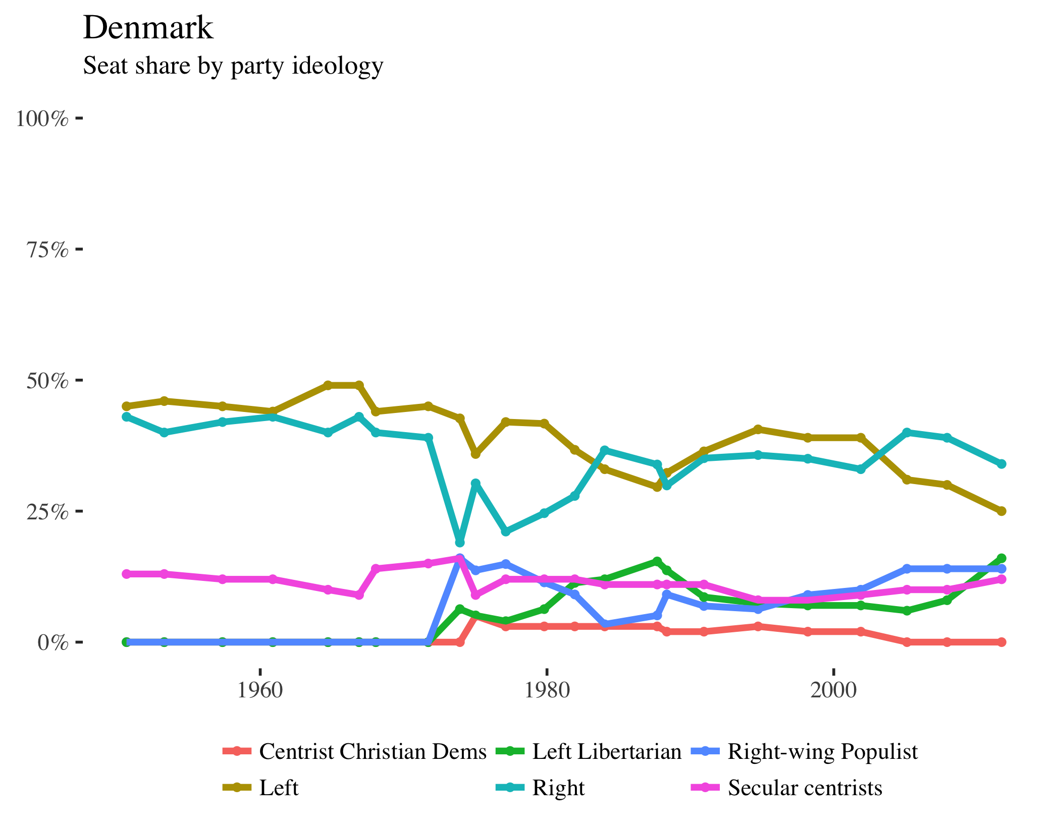
Finland
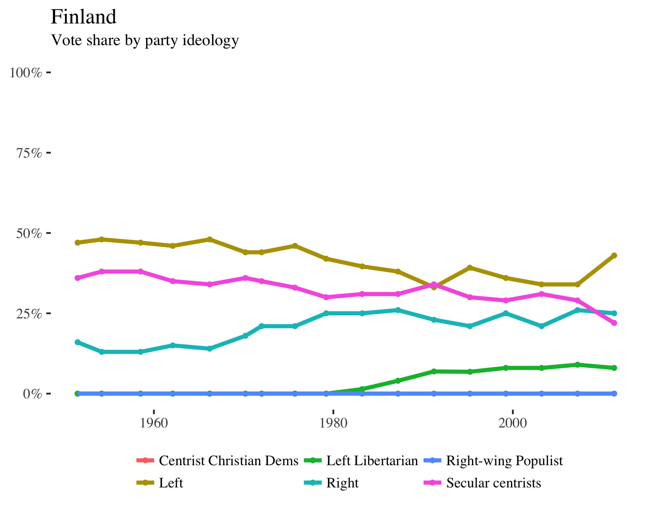
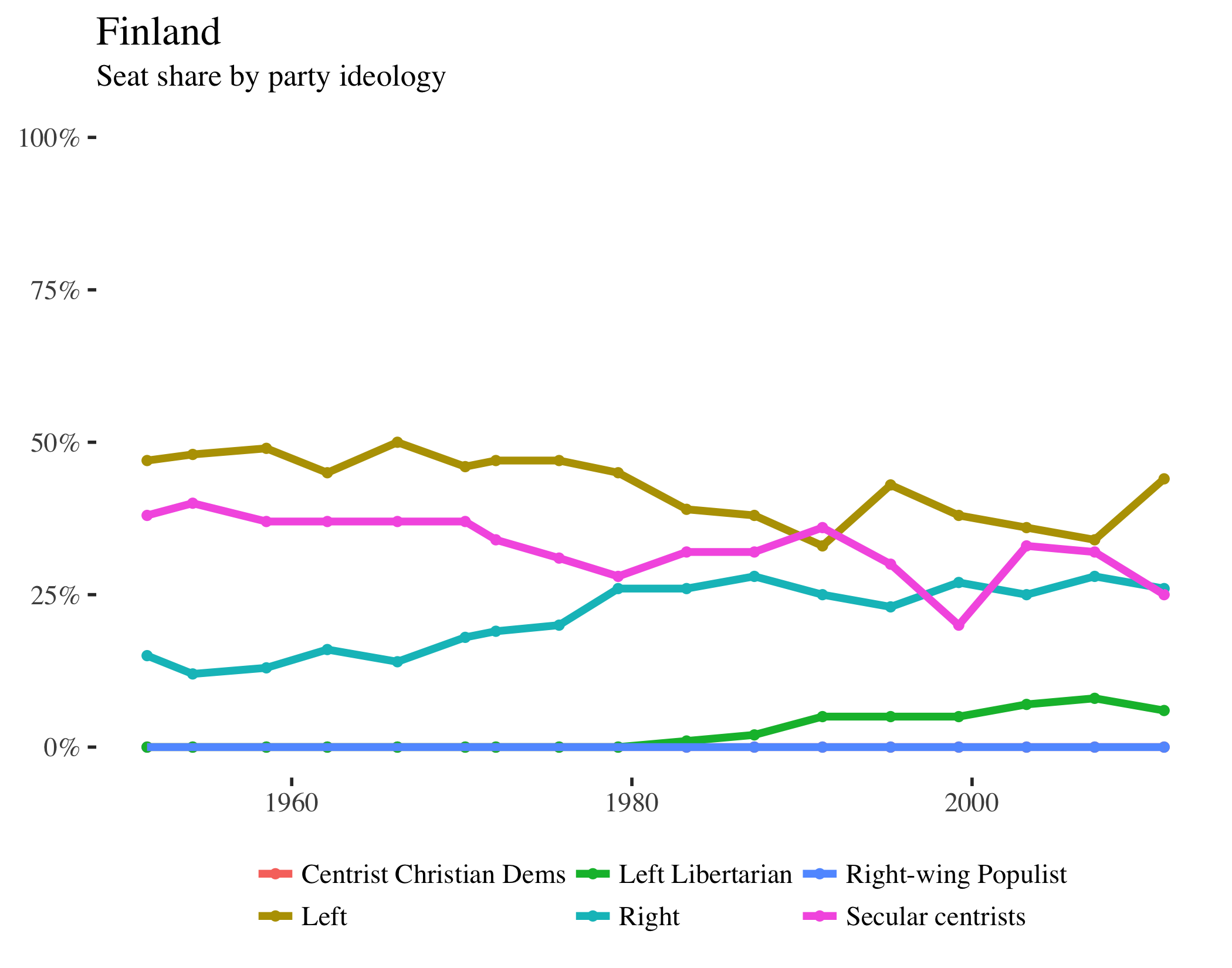
France
Federal Republic of Germany
Ireland
Italy
Japan
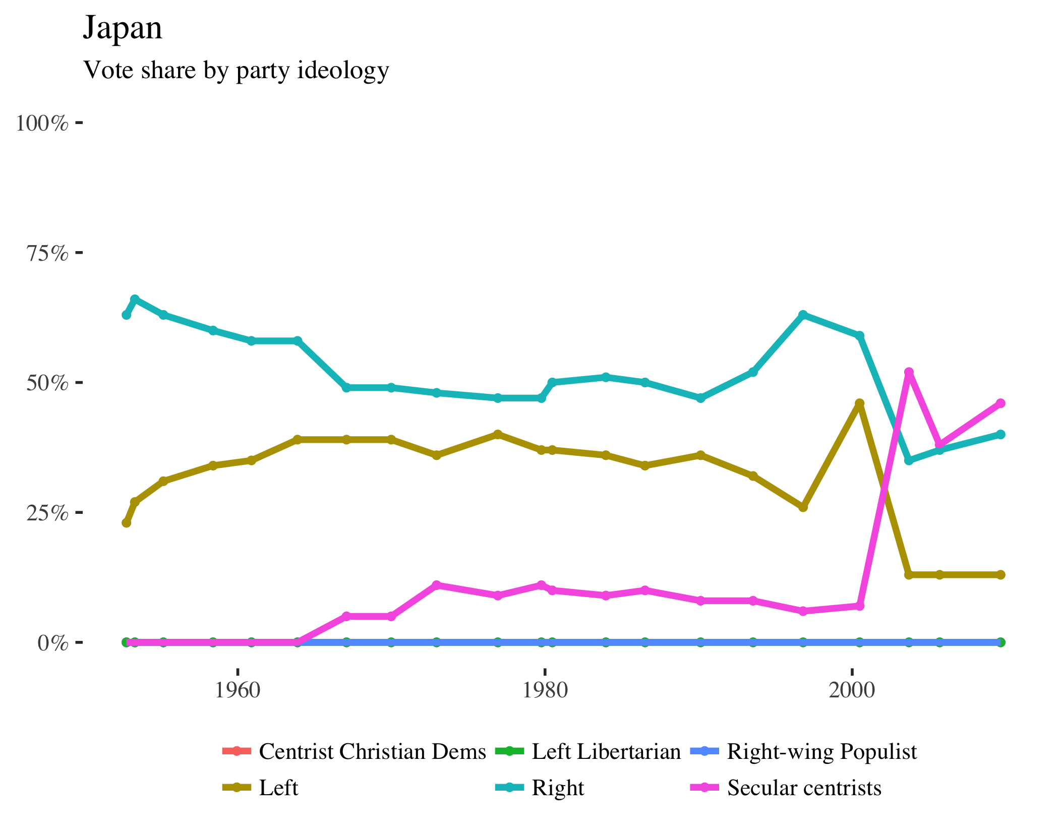
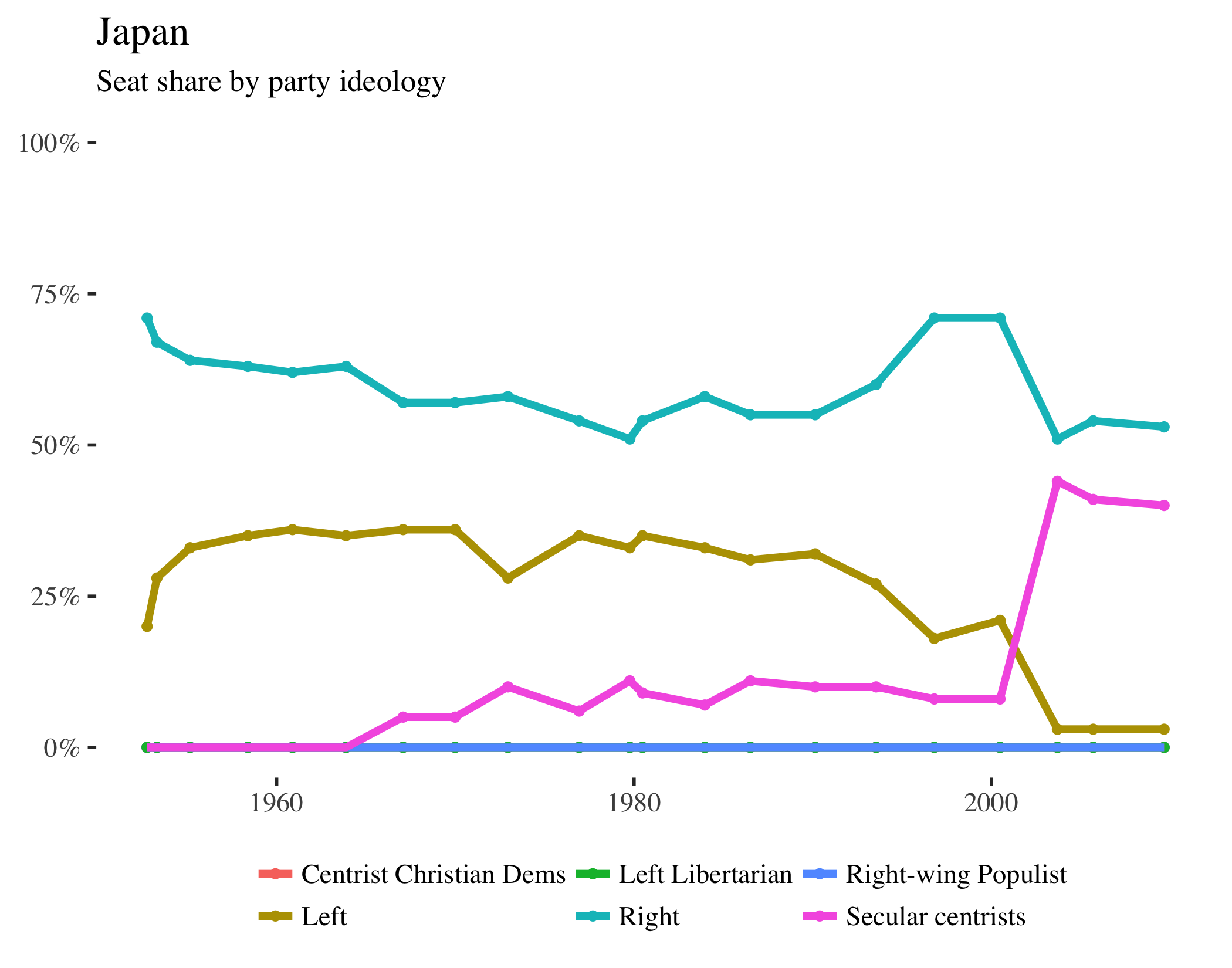
Netherlands
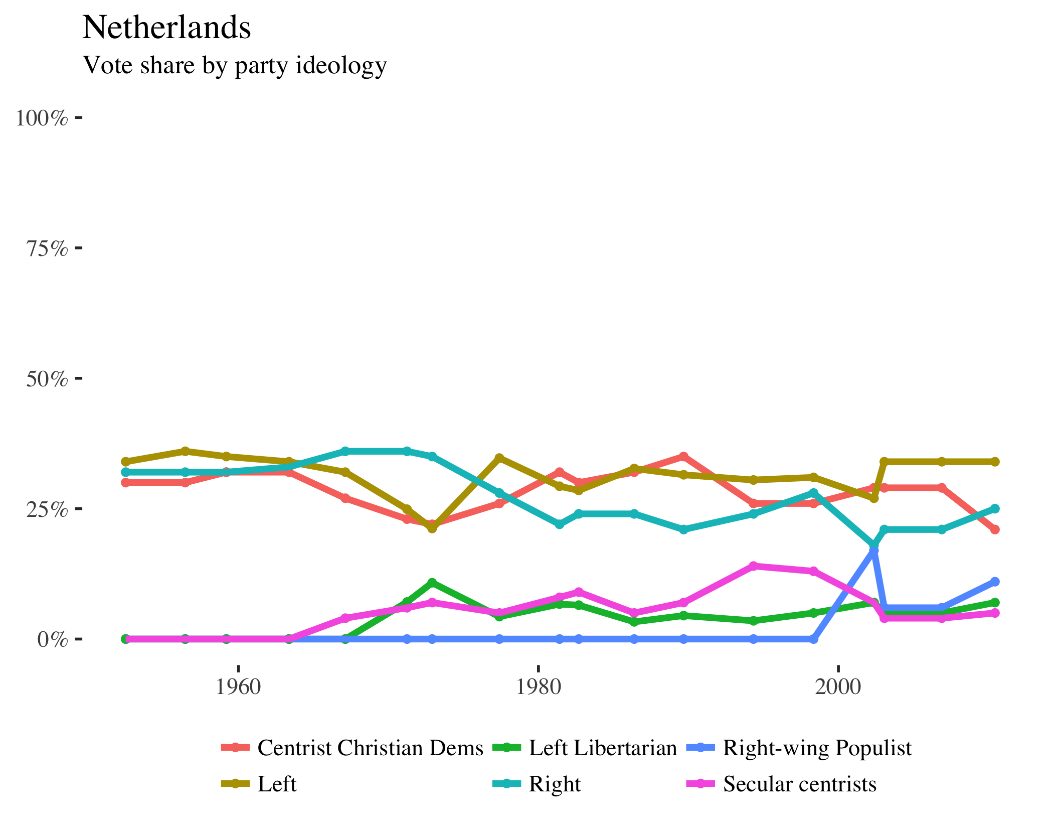
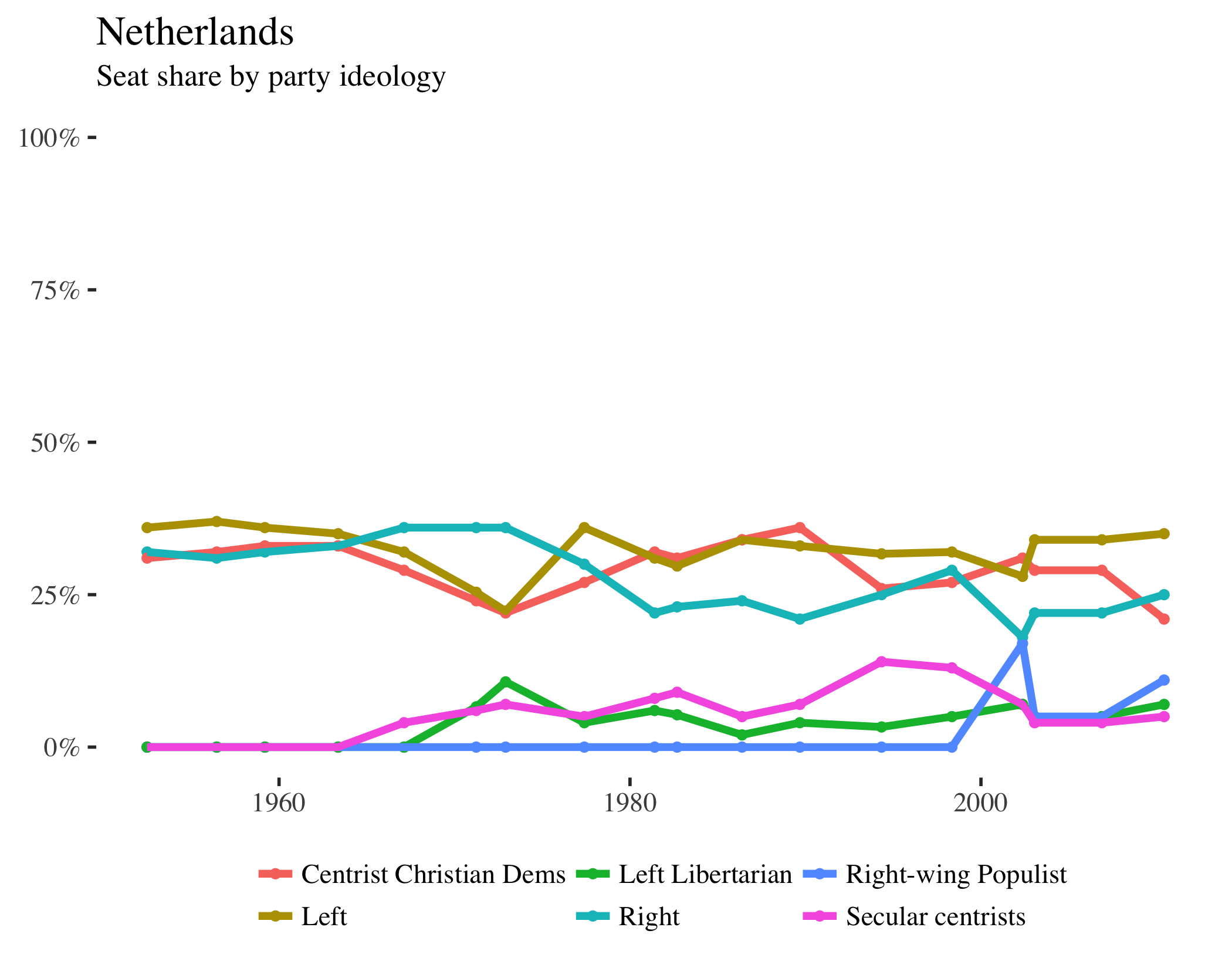
New Zealand
Norway
Sweden
Switzerland
United Kingdom
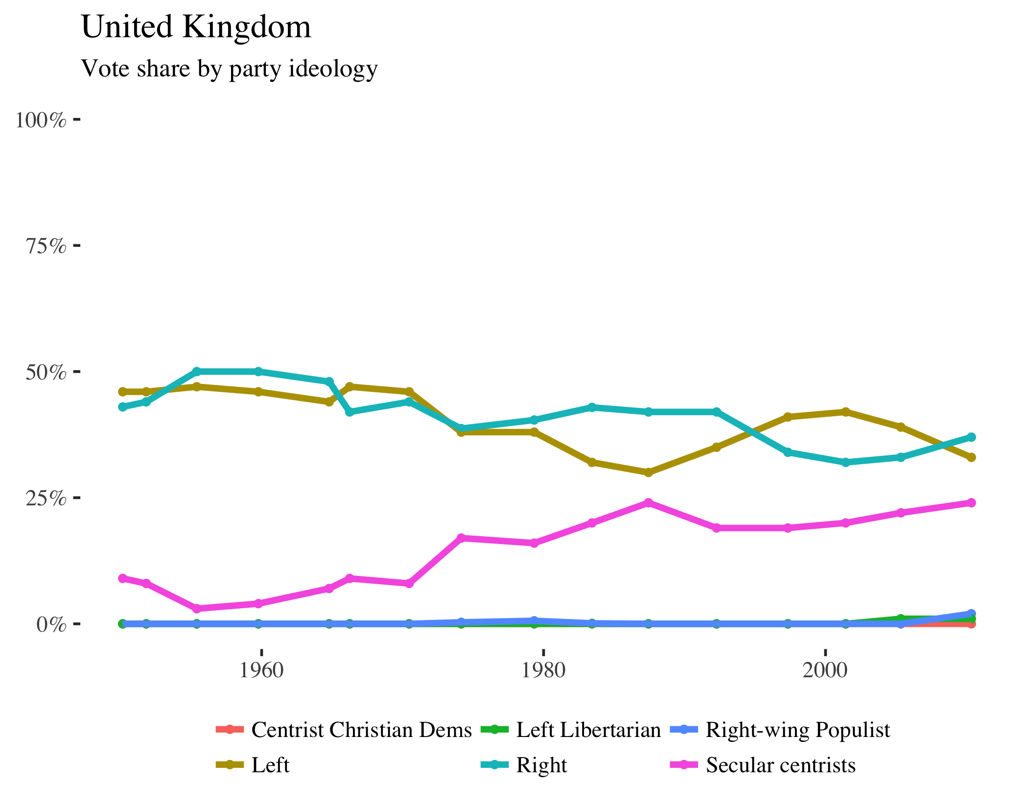
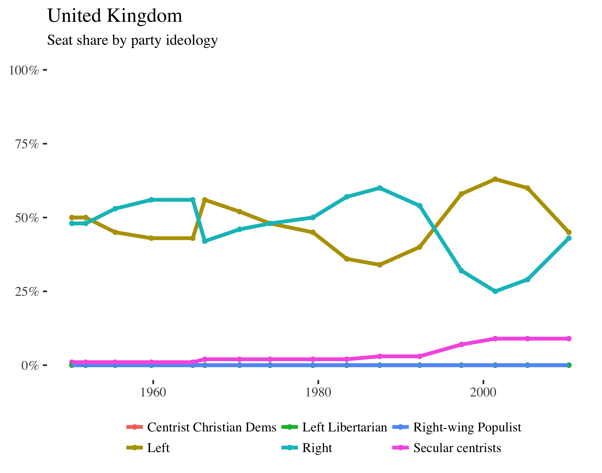
United States
Greece
Portugal
Spain
Duane Swank, (2013). Comparative Political Parties Dataset: Electoral, Legislative, and Government Strengtht of Political Parties by Ideological Group in 21 Capitalist Democracies, 1950-2011. Electronic Database, Department of Political Science, Marquette University, http://www.marquette.edu/polisci/faculty_swank.shtml.↩
Learn how specific parties were coded using Swank’s codebook. I subtracted left libertarians and right-wing populists from the left and right party vote and seat totals in order to highlight those differences.↩
