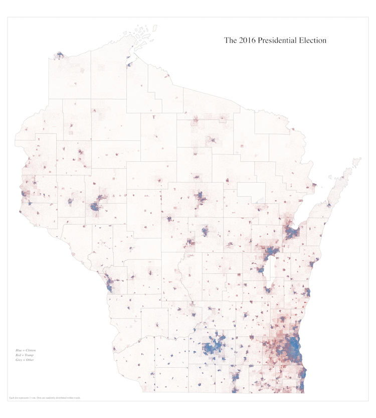
Wisconsin 2016 Presidential Election Dot Map
1 dot for each vote
This map shows the results of the Wisconsin 2016 Presidential election.1 Each blue dot represents a vote for Hillary Clinton. A red dot is a vote for Donald Trump. And a grey dot is a vote for someone else. Each dot is randomly distributed within the ward in which it was cast.2 There are 6,895 total wards. I used a dataset and shapefile from the excellent Wisconsin Legislative Technology Bureau to create it.
This map is inspired by Dustin Cable’s “One Dot Per Person for the Entire United States” racial dot map. It’s amazing; check it out!↩
Technically, the LTSB uses a disaggregation process to assign some votes, which you can read more about on their website. In some parts of the state, individual wards are so small that they are combined into larger “reporting units,” presumably to address privacy concerns. The LTSB redistributes votes into the individual wards. Also, due to some technical difficulties in generating random dots, a very small number of wards are not represented on this map. However, more than 99.5% of total votes are accounted for, so these ommissions shouldn’t meaningfully affect it.↩

